
Topps card #100by dsorek - 71 cards (Last updated on Feb 20, 2022) |

61. 1962 Topps #100 Warren Spahn
Legendary wood border design. Love it or hate it, I happen to like it. What a pitcher. I would've love to have watched him pitch. |

62. 1961 Topps #100 Harvey Haddix
I couldn't imagine a pitcher going 12 innings today with a perfect game only to lose in the 13th. What a heart breaker that must have been. Although this may have been the first dull design for Topps, I still liked it. |
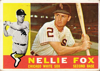
63. 1960 Topps #100 Nellie Fox
One of the best 2nd basemen ever who died far too young. I like the colorful names in this set and I also like the highlights of the year on the back even though the color scheme on the always looked dirty. |
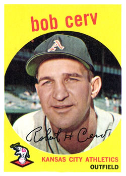
64. 1959 Topps #100 Bob Cerv
Bob had a great year in '58 which is why he was likely honored with card number 100. Bob also looks like he took a few baseballs off the nose in his career. The '59 set is iconic with the bold colors and Topps' use of Christmas colors on the back. |
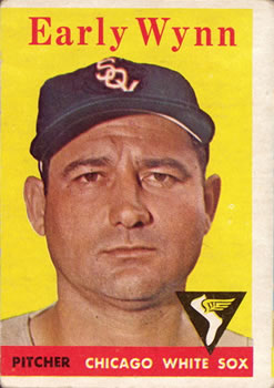
65. 1958 Topps #100 Early Wynn
Early is a Hall of Famer who was famous for brushing back hitters. He had some great seasons over 23 years. The full color background makes the '58 set standout in collections. |

66. 1957 Topps #100 William Harridge / Warren Giles
WOW, really? The presidents of the leagues on a card #100. I didn't know they did this. But then again, maybe Topps wasn't using this as an honor card yet. However, in 1956, Topps put these fellas as cards # 1 & 2. Card #1 has also been a card of honor for Topps. The '57 set was awesome for having full color images of the player and full stats on the back. |

67. 1956 Topps #100 Baltimore Orioles
Only team card in the #100 set for Topps. All the cards in the '56 set were like the '55 set with all the fronts of the cards being in landscape, not portrait. The multi color backs had a lot more comics on them. It is a great looking set overall. Here is where I think Topps started to design two years at once. |

68. 1955 Topps #100 Monte Irvin
Monte is another HOFer and one of the first to enter to break the color barrier after Jackie Robinson. The '55 set has nice photos and beautiful multicolor backs with a lot of nice information. |
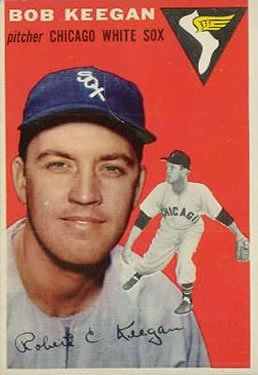
69. 1954 Topps #100 Bob Keegan
With all the superstars in the game in '54, I'm not sure Topps was using card #100 as such a prestigious card yet. Bob had a short career, but he did throw a no-no in 1957. These full color background fronts and multi-color back cards a really a treat. I love all of these 1950's designs. |
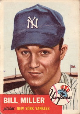
70. 1953 Topps #100 Bill Miller
Wow, this and other cards of this era seem so airbrushed, they look like cartoon characters. Bill had a short career with the Yankees. I'm guessing this would've been a 'common' card back then, but I'd love to have this card. |
Comments
Actually, 1982 - 2007 is 25 years without facsimile signatures, not 15!
| ||
Thanks for the list! It was a fun trip down memory lane.
| ||
Nice list. Not to be a party pooper but you are missing 2012.
| ||
Great list, by the way. I really enjoyed looking at these.
| ||
Open the list! I wanna see....
| ||
Outstanding work. I love that Topps does this. And I love looking through the cards through the ages. I assume you'll now do 200s, 300s.... ??
| ||
very cool brotha...I love the way Topps honors the great players...I thought UD was onto something with Griffey and their number one card in 89, buuutttt.....nope...
| ||
I'd like to look back at number 1's...
| ||
Ugh. Still love the list, but learned through you that career stats are gone. So painful. Trying not to hate the messenger.
| ||
The 1953 Topps cards were not airbrushed. They were all individual oil paintings by artist Gerry Dvorak. | ||
Woah, full stats are back for 2019. That's worth an extra star or two on the 'ol rating, that's for sure.
|

")