
Random Card of the Day |

Wednesday, May 12, 2021Set: 2008 Upper Deck Documentary (Rate) “ the blurb at the bottom says the Rangers won with pitching, and on the back, it talks about the starter Matt Harrison, so why exactly is the front a pic of Ian Kinsler, and making this a Kinsler card? ” -abide
4
“ Topps Now before there was Topps Now. A very ambitious project by UD that ultimately fails to answer the question: why? Maybe if my Mariners had a spectacular 2008 season I could see myself buying these cards. (Spoiler alert: they didn't). Otherwise, these should be relegated to the dime or less bin at your LCS ” -ketchupman36
1
“ Very ambitious set, which I liked in theory. Too bad there were so many recycled photos with most of the photos having nothing to do with the game being depicted. ” -jupiterhill
8
“ Base set: 4890 cards. Hobby box: 24 packs. Cards per pack: 15. Gold parallel version of 4890 card base set: 1 per pack. Price per pack: $3.00. People who have completed this set: 0 ” -Id8jlb8666
1
“ This was an interesting and ambitious idea for a set, but ultimately I am disappointed in it. This card is a prime example. The images of the players are reused over and over, the the synopsis on the back highlights the work of Matt Harrison, yet the player pictured is Ian Kinsler and almost certainly not a photo from the game referenced. If this set had the player highlighted in the write up with a photo from that particular game this set would be top notch. ” -rmpaq5
1
“ OK design but the concept is too overboard and poorly executed. The concept was to document every game of the season, making the set grossly large with 1,000s of cards. Each player has 20some cards or more with each card having the exact same photo even though each card is documenting a different game. It results in a very boring set.. ” -captkirk42
“ This set is really cool. One card per team per game for the whole season. Must be annoying to collect the whole set though but I would totally buy singles of games that I went to. ” -pugchump
“ Interesting concept, probably not feasible to go all the way and have an image from each game instead of blocks of reused images. ” -jackal726
“ Is there anything on the card itself to indicate that it is Ian Kinsler, or do I need a checklist to know that? The idea of the series is too ambitious . . . A day-by-day account of the season includes too many lowlights, when nothing significant happened . . . The card itself is fine, but so what? Do I need to have it? . . . ” -georgecf
“ Oh boy. Anybody who has ever tried to add one of these cards to their collection on here, let alone uploaded the checklist, will hate this set. Should make for some good comment section... ” -pjdionne12
“ This was a great idea that was terribly executed.
They should have put the player or big play of the game on the card using a picture from that game instead of the same pictures and players used over and over. That said this is a great set to give the history of season. ” -goreds00
“ This is a creative concept and really was a forerunner of the Topps Now cards, but honestly, I don't think every game in a season requires 2 cards. Maybe if you were a Phillies fan, you'd chase the team set to remember winning the World Series that year, but I don't need 163 cards to remember that my Cardinals finished in 4th place that year. ” -vanstryland
“ meh, not a parallel set needed. ” -parsley24
“ The most unnecessary and poorly executed set in the history of trading cards. Take a bow, Upper Deck :P ” -mkaz80
1
“ E ” -crashdavis28
1
“ Unfamiliar with this set, but I am intrigued by any set with almost 5,000 cards. ” -muskie027
|
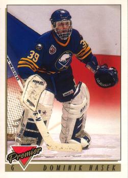
Tuesday, May 11, 2021Set: 1993-94 O-Pee-Chee Premier (Rate) “ in all the garbage of sets from the late 80s to 90s i will say 92-93 in most of the sports put a pretty decent card out. This one is no exception. ” -parsley24
“ Nice card of the dominator. I like the flag background good contrast with the foreground. The back is very busy! ” -M_
“ Another Hall of Famer. Third one this week, although the last two were in the NFL. ” -pugchump
“ I really like the Topps version of the set. The only way you can tell the O-Pee-Chee version from Topps is by the French on the back. I do like the O-Pee-Chee version despite this. ” -Brendan Barrick
“ Oh my! I can't hide my excitement. A Sabre! A GREAT Sabre! The Dominator! The memories and a great time in the Sabres history, as well as a Stanley Cup appearance (Hull's foot was in the crease!)! I couldn't be more excited at the choice of the RCOTD today! ” -muskie027
1
“ *drops everything* ” -crashdavis28
|

Monday, May 10, 2021Set: 2005 Fullmetal Alchemist Blood & Water TCG (Rate) Card: #24 Vato Falman, Warrant Officer “ I think Snoop Dogg made a song about him. ” -volbox
1
“ I liked this show when I was an edgy teen but this TCG looks kind of lame ” -pugchump
1
“ i bet every comment above mine is one of those "not productive" comments that infuriate people who collect these tcg cards. ” -parsley24
6
“ Random manga/anime card game. MMMMMKAY. I guess there are collectors of it an maybe some players out there. ” -captkirk42
“ I'm at a loss for words. ” -muskie027
|

Sunday, May 9, 2021Set: 2009 Grandstand Montgomery Biscuits (Rate) “ If this pitcher had a rubber arm, would he be a rubber biscuit? (What do you want for nothing?) ” -abide
2
“ When I was younger I always though the Montgomery Biscuits had the weirdest team name in baseball. They definitely set the standard for some of the newer more unique minor league team names. ” -pugchump
4
“ Grandstand Montgomery Biscuits. I'm heading to the grocery store right now to get me some. This has got to be one of the most fun minor league team names out there, and I'm sure the Duchess of Pork, Miss Gravy agrees! ” -CollectingAfterDeath
3
“ That is the most "Little League" Hat ever on a card. ” -rmpaq5
“ Biscuits! i love obsure minor league team names, nice clean design too ” -Thunderfoot
“ Nice-looking card . . . ” -georgecf
“ Great name for a team.....if it was hockey.. And a very nice card as well. ” -NJDevils
“ Nice minor league card. Biscuits? Sounds like breakfast not baseball. ” -captkirk42
|


Friday, May 7, 2021Set: 2003 Upper Deck Finite (Rate) “ OK design. The front kind of looks like they player is coming out of the film/photo slide (or picture frame if you are not familiar with photo slides). Back is OK. I never really liked the serial numbering for this set, either the font that was used or the fact that the "base" set was serial numbered. Ah first generation high end cards. ” -captkirk42
“ Super lame for an SN card. The number isn’t even centered lol. ” -pugchump
1
|

Thursday, May 6, 2021Set: 1994 Upper Deck All-Time Heroes - 125th Anniversary (Rate) “ To me he was the Dodgers hitting coach, and roving ambassador to the fans. He seemed to be a guy who would bleed Dodger blue, just like Lasorda. ” -abide
4
“ I have nothing to complain about scan wise :). Although I remember actually while scanning this card thinking why would Upper Deck use a photo (a cool photo) of a guy who played 6 years for the Pirates, and 11 years for the Dodgers, and make a card of him on a team that he played 31 games for? They apparently could not even find a head shot of him in an Expos cap for the insert photo. ” -rmpaq5
3
“ Cool concept but terrible picture. ” -cjjt
3
“ Nice commemorative card. ” -captkirk42
“ I've got to concentrate... concentrate... concentrate... Hello?... hello... hello... Echo... echo... echo... Pinch hitting for Pedro Borbon... Manny Mota... Mota... Mota... ” -tenlbpain
3
“ Never heard of this set and despite the low rating by some users, I like it! Mulling over a box, but a bit spendy! ” -bkklaos
“ Very cool ” -pugchump
“ This is a very interesting card. It reminds me of some older cards with the player head. But also has a really nice photo on the player head. You can never go wrong with all-time hero's cards. ” -cardcollector65jw
“ Colored pictures of Expos are awesome, so I have to take points away for the black and white. ” -muskie027
|

Wednesday, May 5, 2021Set: 2016 Topps Gypsy Queen - Relic (Rate) “ Soler Power! ” -jupiterhill
3
“ Love Gypsy Queen. Always top tier designs. ” -pugchump
2
“ Nice relic card. ” -parsley24
“ Lot's of Gypsy Queen this week. Nice to see the highly desirable pinstripe make an appearance. ” -jackal726
“ I always liked how Gypsy Queen looks. The shots just look so nice.
Soler before he really took off hitting homers ” -mkb
“ Nice looking relic card. On a side note it kind of looks like a mini card, the relic side crossed with a Goudey card. ” -captkirk42
1
“ Nice looking relic! I give this one props the picture is cool, the design looks nice and the relic goes nice with the card, not overpowering. Good card! ” -muskie027
“ Love relics with pinstripes. ” -702tpr777
|


Monday, May 3, 2021Set: 2014 Upper Deck - Rookie Letterman Autographs (Rate) “ I went through a phase of getting SP Authentic by the letter autographs of Angels, in order to spell A-N-G-E-L-S, that was fun. I saw other collectors do it, and said to myself: I can do that too. After reaching my goal, and then expanding it to spell "Los Angeles" I was done. On looking back, the autos are kind of disappointing. Not in the same neighborhood as an on card black sharpie. ” -abide
1
“ I had to google who this guy was but he’s got some pretty good numbers for only being 5’8” ” -pugchump
“ Why is it an O or 0? It's not his number, and there's no O in his last name or in Kent State. So, they're just spelling out "Rookie?" But why though? *rolls eyes* ” -vanstryland
6
“ Where the hell is the "O" from? there is no O in his name nor school. ” -parsley24
“ Nice card for what it is. ” -captkirk42
“ Give me an O! ” -Brendan Barrick
“ 0 is the number of Dri Archer cards in my collection. No seriously, I checked. ” -CollectingAfterDeath
“ Oh? ” -Ken Kinsey
“ Love the signed jersey card. Wish they made it more common. ” -OverkillKid
“ An exciting college player. ” -muskie027
“ Sooo... His name is Dri Archer, and he went to Kent State. Why is there an 'O' on this card again? ” -mkaz80
“ pretty sure there is no "O" in Archer? ” -Thunderfoot
|

")