
Random Card of the Day |

Friday, November 3, 2017Set: 2010 Topps WWE - National Heroes (Rate) “ Booyaka Booyaka. I was always a big fan of Rey Jr. Really one of the all time greats. His matches with Jericho were incredible. And I really liked this insert set, with the flag backgrounds, though I don't have this particular card. Best RCOTD I've seen in a while. ” -switzr1
“ Booyaka Booyaka 619 ” -trauty
“ Wow...this is...lame... ” -YoRicha
“ Sweet card! ” -kents_stuff
“ "Mysterio has taken his heritage one step further by tattooing 'Mexican' across his med-section..." I never realized how unpatriotic I am. ” -dilemma19
“ Cool card. Wrestling cards do feature some colorful characters! ” -olerud363
“ They should make all his cards #619, Booyaka, Booyaka ” -Lennoxmatt
“ Cool Wrastlin' card. ” -captkirk42
“ King Mysterious! ” -deporcoruña
“ Kids love them some Rey Mysterio Jr...but not as much as Tony Schiavone does! ” -beansballcardblog
“ Is Rey Mysterio on El Rey's La Lucha Underground now? I keep seeing the commercials and want to get into it, but I haven't yet. As for this card, I actually love it for a Heroes insert! ” -muskie027
“ Booyaka ” -Bargunmaster
|
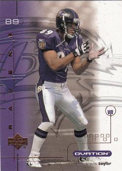
Thursday, November 2, 2017Set: 2001 Upper Deck Ovation (Rate) “ The embossing on the Ovation sets were always interesting. ” -Billy Kingsley
“ "Come on guys I'm open. I'm open. Did you hear me? I'm open! Pass it to me!" ” -YoRicha
“ I like it, it has substance. ” -carthage44
“ That's the same position our obstetrician took right before my daughter was born. ” -royals
“ Not one of my favorite Upper Deck products. Looks like it should be a screensaver. Same photo for front and back. Blech. ” -mkaz80
“ Pros: Ravens Cons: Never heard of the guy, busy design ” -IfbBirdsCards
“ Ovation? No thanks I'll sit. Poor front design the player name is the last thing you see, or maybe the team name. Nice team logo in background. Back minus tons of points for using same photo, plus you don't need photos on the back. Oh I think this was a high-end product. Back OK the card number is the last thing to see. Plus only one year of stats. Two thumbs down, at least. ” -captkirk42
“ I like the raised feel of this set. Pretty cool, I think. ” -cjjt
“ He looks pretty wide open. Throw him the ball! ” -switzr1
“ Nice design, but busy. All the Ovations I remember were pretty busy. I like the logo in the background. I hate using the same photo front and back. Pay the photographer to take a few shots next time. ” -kents_stuff
“ Watching the Ravens and this is the RCOTD to write about. Kind of funny. I don't mind this card, even though I feel I should hate it. There isn't anything special about it, but it isn't awful, probably because of the use of the team colors. Travis Taylor never amounted to much in the NFL, but a great college WR. The small name is awful! ” -muskie027
|

Wednesday, November 1, 2017Set: 2000 Milwaukee Journal Sentinel Brewers All Decades Team 1980s (Rate) “ Neat card. I like seeing these oddball regional or team issues. ” -olerud363
“ I like it! If only I was a Brewers fan I'd collect the set. ” -Sportzcommish
“ I love this card! There are a few nits I could pick, but overall I consider it to be very well designed. ” -dilemma19
“ When the Brewers used to be in the AL. ” -carthage44
“ Front too wordy. OK a card made by a magazine figures. Looks informative. But I won't be adding to my collection. Don't collect the team or the player. ” -captkirk42
“ Wow...all I needed to see were the (sun)glasses and I knew this was Jim Gantner. Talk about turning back the clock... ” -beansballcardblog
“ I like team issued cards. This is a winner with me. ” -switzr1
“ Overall I like it. Good general design, and unique (I think) with the name/position/uniform # in a diamond mid-card. I wish the back had just 80's stats instead of career, since this is an all-decades team. ” -kents_stuff
“ This and the others with images submitted are quite nice, especially for newspaper insert set. The in depth write up on the back is great. ” -rmpaq5
“ Different. I like it. Lots of info on the back. Picture taken by Journal Sentinel thus you know it is unique. ” -cjjt
|

Tuesday, October 31, 2017Set: 2017 Panini Unparalleled - Pink (Rate) “ one of the many parallels from Unparalleled. ” -trauty
“ A set called Unparalleled, so what is Card of the Day? A Parallel. That's hilarious! ” -Billy Kingsley
“ This looks like that nuclear volcanic lava card I got from the eBay the other day. Is the whole idea of unparalleled that they have 500 parallel sets? Or is it just the regular 75 that everything else has? ” -switzr1
“ This must be an unparalleled parallel. ” -deporcoruña
“ Oh that’s nasty. ” -IfbBirdsCards
“ Too much going on, and I don't like pink. ” -Sportzcommish
“ "Unparalleled" perhaps not the best name for a brand with 10 different parallel versions listed in the database. ” -bevans
“ Cards like this makes me hate that Panini has the exclusive rights to the NFL. BRING BACK TOPPS FOOTBALL PLEASE!!! ” -carthage44
“ This is what I would expect from 80's MTV ” -aussiewayne
“ ugh... I long for the days of a single parallel set or insert set.... ” -SFC Temple
“ Unparalleled. I would love to see a set that is unparalleled these days. Or maybe the design is unparalleled? That background is a bit hard on the eyes. You would think it's an 1980s design. This is the "pink" version? Well maybe they should have named the set Ironic. A parallel unparalleled. I think the time/space continuum imploded on itself with this one. ” -captkirk42
“ Whole lotta nope on this one. ” -parsley24
“ Pretty pink card. I like that there's a write-up on the back, but nothing else about it is very interesting. ” -dilemma19
“ Pink....as in Pepto Bismol......that's what I needed after looking at this card. ” -NJDevils
“ "HEY YOU KIDS, GET OFF MY LAWN!" This card is just way too busy for me. I do like that an OL gets a card, though. ” -beansballcardblog
“ Wow. Unparalleled? Unparalleled in what? Ugliness? The player gets lost in that absolutely horrible background. And pink to boot. To paraphrase Tom Hanks in "A League of Their Own", "There's no pink in football." ” -C2Cigars
“ The pride of Hillsdale College, my brother's alma mater. They take no government funding, but apparently can develop a giant Offensive Lineman. ” -royals
“ There's a football player in there somewhere.... ” -jayoneill
“ Looks Very, And I Mean VERY Colorful. The Pink and red mix together Like Bread And Butter. Very Nice Card 9/10. ” -Thomas555
“ Did a valentine explode on the front of this card? ” -kents_stuff
“ I took a look at this and thought it was from the 80s at first. That pink and garish design... Definitely not my kind of design. ” -wmcduff
“ Wow.....a lot going on there.... Why am I looking for Max Headroom? ” -Joshua825
“ I don't know if an uglier card could be produced. ” -WallyCub
“ At first I thought this was a Teen Bop magazine card, then I realized there was a football player on it. It would actually be pretty cool and I would say I liked it if it was some sort of breast cancer awareness card or if some proceeds went to breast cancer research. If it is pink for the sake of pink and another parallel set however, then oh my God how awful. ” -muskie027
“ It’s a breast cancer awareness card! Good for Panini! Wait. It isn’t? Oh, then it’s terrible. ” -Vvvergeer
|

Monday, October 30, 2017Set: 1999-00 Topps Chrome (Rate) “ I used to really love Topps Chrome. It used to be one of my favorite sets. Then I started scanning my collection, and now I don't love them as much. In hand they still look great but getting a scan out of them is a chore. This sets is particularly bad to scan for some reason, worse then other years of the brand. Darrell Armstrong was in the NBA years before he got cards, but eventually he was starting point guard on some good but injury riddled Magic teams. I still do a double take when I come across one of his Hornets cards, he's so ingrained as a member of the Magic in my head. ” -Billy Kingsley
“ Great action shot with no other player in the picture. My kind of basketball card. ” -Sportzcommish
“ Nineties era card for Basketball. I'm not a big fan of either so I'll pass on this one other than to say it isn't a bad image just plastered on a chrome card. ” -koloth42
“ The chrome makes him look super skinny. ” -carthage44
“ Odd to see an in-game action shot without any other players in-frame. Tough to read (of course, chrome), but I like the clean layout. No excuse for the microscopic font size on the back. ” -dilemma19
“ Chrome. Not my fave type of card. Back no major complaints. Don't really need a photo of the player on the back, that may just be me. Front OK design would be better non-chrome. ” -captkirk42
“ Okay, I admit it, I hate Chrome cards. Not just the scans on this site (or others). I don't even like the ones I have. However I will say that I like this design. If it were not chrome, I think it would be a winner for me. I'm especially partial to the back on this card. ” -kents_stuff
“ This is literally the first Topps Chrome card I may have ever seen. The only other time would have been on RCOTD, but I can't recall if there was one. As for my thoughts? Meh?!?! Would have been better in non chrome form, I think. ” -muskie027
“ It's OK ” -switzr1
|


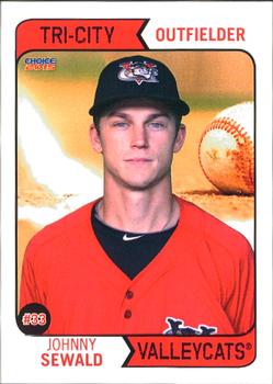
Friday, October 27, 2017Set: 2015 Choice Tri-City ValleyCats (Rate) “ I like seeing the knockoff designs choice uses...especially interesting when they copy a non-baseball set, which I have seen in the past. I wish Choice would move more into my sports, because I like what they do. ” -Billy Kingsley
“ ...looks like a '74T card. ” -RoundtheDiamond87
“ I kind of like the 1980 design, but not with the Photoshop baseball in the background. ” -olerud363
“ Hey, it's a 1974...er...2015 minor league card! ” -cckeith
“ NY-Penn League. I still don't know how Choice got away with using this design. (Unless Topps puts out Choice? Hmm.) As much a fan of MiLB sets as I am, this one has plenty of areas of improvement. I'm sure the rest of the comments will cover them all. The one plus I'll give it - it includes at least a year of college stats for someone with no pro experience, which is a lot better than most MiLB sets. ” -vrooomed
“ Nice, using the 1974 Topps design. They could lose that background though. ” -IfbBirdsCards
“ The backdrop is cool! ” -carthage44
“ Tri-City Valleycats from Troy, NewYork Houston Astros Single A Short Season Affiliate. Check out their website at www.tcvalleycats.com ” -jayoneill
“ Very nice card especially for the minors. This is even a lot better than many produced for the majors. ” -NJDevils
“ I love the design for a minor league team set. Then again, I love minor league baseball cards in general. ” -jasongerman9
“ The Front has that 1974 Topps Feel. ” -kirkscards
“ I do enjoy minor league cards. This one looks like it could have been a Fleer design from the late 80s or early 90s. ” -koloth42
“ Wow, a card from my local team. I go with my brother-in-law when he gets free tickets from his work. Of course I like the front, it's vintage 1974 Topps. Does Topps own Choice? Or is it just a blatant rip-off? While they were at it they should have copied the back design, also. ” -C2Cigars
“ The 1974 Topps Baseball design used to be one of my most favorite designs.Then Topps started over using past designs in anniversary, tribute and archives sets. Now minor league teams using the older designs. I wonder if Topps could sue Choice cards for using the front design? The back looks nothing like the old 74 set which is a good thing.The back looks like a typical Panini or UD back. ” -captkirk42
“ I like the back, and I like the original Topps 74 Baseball design that this might have tried to borrow. But for some reason I don't care for the front here. Font, maybe? The red color? Not sure. ” -kents_stuff
“ Ok the 74 Topps/OPC rip off I can actually get behind, nice vintage design, but what the HE double hockey sticks is going on in the background? It is like the opening scene of Raiders of the Lost Ark. Run Johnny! A giant baseball is trying to crush you! Run! ” -rmpaq5
“ 1974 Topps look on a minor league card. Did they have to pay Topps for the design or is Choice a Topps brand? ” -muskie027
“ Sad that the front image wasn't cropped properly before being uploaded but I love the retro Topps design of the layout. ” -UKboogie
|
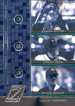
Thursday, October 26, 2017Set: 2005 Donruss Zenith - Mozaics (Rate) Card: #M-14 Adrian Beltre / Jeremy Reed / Richie Sexson “ Normally, I like triples, but this seems off. ” -cjjt
“ I'm sure there is a memorabilia version of this. If not then it is worthless. ” -carthage44
“ Um OK I thought the front was the back on this one. I like many of the Zenith designs but not this one. OH OK its an insert set using team colors. I like the base set better. ” -captkirk42
“ I can see that the 10/11 Zenith hockey stole their mosaic insert design similarity from this set. ” -suomibear8
“ The only saving grace for these for these cards is if they look better in person. Someone tell me they do or I will say this is really bad ” -NJDevils
“ No thank you. ” -IfbBirdsCards
“ I remember him...and him! Who is that other guy? ” -beansballcardblog
“ Donruss ZZZ... Bad scan aside, three players on the right with their last names and team logo slapped on a bathroom floor background. Big Zero ” -NSEndo
“ I'm not a fan of multi-player cards and this one is no exception. Maybe the card is better in person, but the blue color scheme is not impressive and the tile pattern on the side looks like a subway bathroom. ” -cnangle
“ A lot of hope on this card. A lot of heartbreak too. A lot of heartbreak. ” -parsley24
“ Not a fan of this set, and I'm not just saying that because there's no Blue Jay card. ” -DanD
“ Dull, dull, dull. Boring, boring, boring. Ugly, ugly, ugly. ” -C2Cigars
“ Congrats to Adrian Beltre on 3000 hits and hopefully a HOF induction ceremony in a few years. ” -rmitchell6700
|
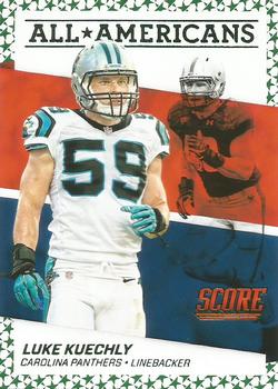
Wednesday, October 25, 2017Set: 2016 Score - All-Americans Green (Rate) “ The gaudy star border ruins this card in my opinion. ” -IfbBirdsCards
“ It is different. ” -Sportzcommish
“ UM OK a "green" parallel due to the subtle green stars on the border. Nice looking card. Like the team, not a fave but since I have a brother and his wife living in NC I can't speak ill of the Panthers. Actually I have liked them since they joined the league but don't super collect. ” -captkirk42
“ Score sets are cheap for a reason. ” -carthage44
“ This card has way too much going on. Bring back simplicity!!! ” -beansballcardblog
“ Ugh. Hate it. ” -cjjt
“ This is fine. One of those inserts I probably got one of from a blaster box. Score is good about getting several different inserts mixed in, and I like to get at least one of each. So I really like these kinds of cards. ” -switzr1
“ Very cool look. ” -parsley24
“ I haven't seen one of these before. A bit odd for my tastes. I'm never a fan of seeing the same photo front and back, And I would prefer to see the Panther in front and Score a bit smaller. On the other hand I like the two contrasting photos on front and also the red/white/blue background pattern. I think the star border might be what is tipping the scale negatively for me on this design, though. ” -kents_stuff
|

")