
Random Card of the Day |

Thursday, November 9, 2017Set: 2003 Topps Retired Signature Edition (Rate) “ What’s missing on this SIGNATURE edition card? I wonder... ” -IfbBirdsCards
“ I always have liked the cards with an action photo and a head shot on the front, any year. This is no exception. Starting with the '54, all the way on down to the '03 sets, they all look great to me. I hope to own one card of each set someday. ” -deporcoruña
“ Mattingly! Mattingly! Mattingly! Sorry what was the question? ” -YoRicha
“ Great design. ” -Billy Kingsley
“ Wow, cool card!! ” -RoyalChief
“ nice retro set. I really should figure out which cards from this set I want. ” -captkirk42
“ He should be a Hall of Famer. End of discussion. ” -carthage44
“ I hate the word "signature". "Try our signature meatballs". Do you write on them? ” -NJDevils
“ Sweet card front. Meh design on the back. That Mattingly guy was pretty good for a few years. ” -dilemma19
“ I thought this looked like an '03T card....never heard of the signature edition though...Mattingly was already long gone by then. ” -RoundtheDiamond87
“ Love this card and the Retired Signature set. This was back when Topps didn't inject umpteen retired players into their various base checklists. ” -mkaz80
“ I'm usually a Topps fan but this card is a little boring. Is this a parallel from the base Topps set? This is why I don't collect modern cards....to many sets, subsets, inserts, parallels etc. ” -cnangle
|
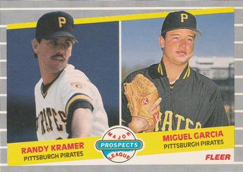
Wednesday, November 8, 2017Card: #647 Randy Kramer / Miguel Garcia “ Lots of memories of my early card collecting days go along with '89 Fleer. Good times! ” -olerud363
“ I got this complete set for Christmas in '89. Great memory of a not-so-great set. Probably my least favorite Fleer design from this era, but overall it still holds a place in my heart. The dual prospect cards are always fun to look back on. ” -mkaz80
“ As dull as grey is, I believe Fleer used the color well as pin stripes. The angles used on the banners add to its attractiveness. ” -Sportzcommish
“ This not one of the prettiest sets out there , but it is one of my favorites. ” -uncaian
“ Just good old classic Fleer. ” -carthage44
“ OK this is the type of "prospect" card I don't mind. The team "rookie card" pairs, maybe up to 3 players. Hey it's KRAMER! Oops wrong Kramer. ” -captkirk42
“ I love these old Fleer dual rookies. This would definitely go in my binder, if it isn't already there. ” -switzr1
“ Combined career WAR of -1.4. (-.5 for Kramer and -.9 for Garcia) ” -royals
“ I did not like this "ruled index card" type design from Fleer. ” -kents_stuff
“ When this set came out I loved it. As time has gone by, I still like it, although everything about makes me think I shouldn't. There is something just really nice about those crazy gray borders with the pin stripes. ” -muskie027
“ dual player cards screw of my organizing! ” -Thunderfoot
|

Tuesday, November 7, 2017Set: 2015 Panini Contenders Draft Picks - Old School Colors (Rate) “ Old School Colors = The Whole World was colorless, it only existed in grainy shades of black and white. Do not adjust your set! ” -royals
“ Like the idea, but don't like the design. ” -Sportzcommish
“ I like this set for every sport, but wish the pictures were in color. ” -IfbBirdsCards
“ There's nothing sadder than a card company losing the NBA license so making fake college cards (fake being years after they left college)...oh wait, there is! It's when they have an NBA license and still make this kind of stuff. Unfortunately, I have this card in my collection. ” -Billy Kingsley
“ Looks like the old collect-a-books. Not awful, but not a good effort, especially with the same pic on the back. ” -muskie027
“ I want more college sports cards! ” -carthage44
“ At first I was going to go full press rant on this card due to the dullness of the look and it being college uni with no mention of pro team, but I noticed the player Beal is a Wizard my Homie Hoops team. So no rant, at least not a negative one. Hmm not sure if I have this one. Probably NEED it. ” -captkirk42
“ Decent blurb about a specific game on the back. What's wrong with the back...a Panini staple same photo!!!!!!!! Also not a fan of the James Bond gun sight effect on the front. ” -rmpaq5
“ I honestly can't handle more than around 3 parallels of anything. That's what crippled the Card Market in the. 90's, the company's could put players images on as many cards as they wanted to and thus the parallel was born! I understand that after 01 or so the Professional Teams and players etc went into contract issues over the sue of players images on more than a set amount of items. One was where they had to have only 2 base cards with a players image and no more than 3 parallels or subsets with their image. Anyone like me, in your 40's 9r so, should well remember how many Micheal Jordon cards Upper Deck issues with him on their cards! Some sets had 50 or more and that saturated the market and 9nly confuses collectors who appreciate the more rare items as well as based sets. I was a "Chase Card Buyer" back then and only had a handful of players I bought etc. That's why I have 60K cards in my house, climate controlled and nonpets or smoking all these years. I got 1 of all LOL. ” -bamaman
“ Uggh! Looks like something my kids would do--use a crayon to color over a picture. TERRIBLE card. ” -cjjt
“ I like it ” -switzr1
|
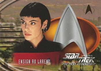
Monday, November 6, 2017Set: 1996 SkyBox Star Trek: The Next Generation Season 5 (Rate) “ I know nothing about Star Trek. I suppose I would like this card if I were a fan. I work with a woman who met her boyfriend in a Star Trek club that she was president of. Maybe she has this. ” -switzr1
“ I remember when Ensign Ro had Trekkies everywhere all hot and bothered. ” -olerud363
“ Oh no. ” -IfbBirdsCards
“ Ensign Ro rocked. Wish they would have used her character more often. ” -rmpaq5
“ Next Gen was always my favorite incarnation of ST. ” -Doe MG
“ Star Trek!? A couple years ago I wouldn't have given this card a second thought, but being a member on this site has expanded my interest in other-than-football cards. With that said; I like the card design. It is really a good looking card front. The back is some what bland and the color scheme is terrible. I'm going to have to take a look at the rest of the set. ” -cnangle
“ I admit that I didn't know that, and am somewhat shocked by, a Star Trek TNG set had over 500 cards in it. ” -kents_stuff
“ More like BABEjoran, am I right? ” -DanD
“ those ears tho ” -parsley24
“ My favorite of the Star Trek shows! ” -Joshua825
|

Sunday, November 5, 2017Set: 1987 Topps American/UK (Rate) “ If I was a football fan, this would be my team... for a hopefully obvious reason! ” -Billy Kingsley
“ Wow, had no idea Topps did UK sets for football, too. I'm guessing these are 'mini' sized like their baseball counterparts. The addition of the team logo on the front is a nice touch -- and something the regular American base cards lacked. This would technically be Jimbo's rookie, if not for the USFL issues. Go Bills! ” -mkaz80
“ I think these are hard to find. Cool RC of HOFer Jim Kelly. ” -carthage44
“ I never knew there was a UK version of this set. This is my second all-time favorite card (the American Topps version) and it is my all-time favorite player in any sport. Let's go Buffalo! There aren't many people you will find more tough or more backed by their city. Jim Kelly pretty much IS Buffalo. The man is always around and will give EVERYONE the time of day if they ask. A legend, a true HOFer, and the best RCOTD since I joined the site! ” -muskie027
“ Not a bad card at all...I really like the colorful back. I do wonder how longer team names would have fit in the pennant at the top, but I know a good website I can go to and check that out! ” -kents_stuff
“ UM OK Topps American/UK? Talking football? Was this a set that was part of a "talking football" game? For sets like this it would be nice if there were a part of the database for set descriptions to tell how the sets were distributed if different from the traditional packs in boxes sets. ” -captkirk42
“ Would have loved to see this guy get a SB ring. Will go down as the best QB the Bills have ever had... ” -rmitchell6700
“ Never understood why the UK cards were nicer than the US ones ” -SFC Temple
“ I like it! ” -nubala
“ Topps American/UK? Which is it? I am completely unfamiliar with this set. Nice looking card, regardless. ” -switzr1
|
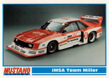
Saturday, November 4, 2017Set: 1994 Performance Years Mustang Cards II (30 Years) (Rate) “ I really don't know much about these. It is a cool looking car though. ” -muskie027
“ Awesome! I somehow missed this set when new, which is crazy because in 1992 cards were everywhere. I still don't have them. I need to fix that. ” -Billy Kingsley
“ There was a time when I enjoyed Mustangs with or without spoilers. This is not one. ” -Sportzcommish
“ There should be something illegal about this. If there was ever a promotion FOR drinking and driving... this would be it. With that being said, what a boring card. ” -YoRicha
“ Looks like a toy matchbox car. ” -carthage44
“ Not my thing, but a nice design with decent information. But why not say when the Lola team was building this particular version? ” -kents_xtras_trd_sell
“ This card may actually convince me to collect racing cards (Mustangs only, of course). ” -jayoneill
“ Nice car ” -switzr1
“ One must wonder what the logic behind the centering -- or lack thereof -- on "IMSA Team Miller" was. ” -revnorb
“ Nice Non-Sport set. YES NON-SPORT the set is devoted to the make of the car Mustangs not to car racing. This sample card happens to show a race car. Since I don't have the set I don't know how many race cars are featured in this 100 card set. Oh it is the second set of a series that I am guessing is a 3 part 300 card mega set? Or just 2 part 200 card set? ” -captkirk42
|

Friday, November 3, 2017Set: 2010 Topps WWE - National Heroes (Rate) “ Booyaka Booyaka. I was always a big fan of Rey Jr. Really one of the all time greats. His matches with Jericho were incredible. And I really liked this insert set, with the flag backgrounds, though I don't have this particular card. Best RCOTD I've seen in a while. ” -switzr1
“ Booyaka Booyaka 619 ” -trauty
“ Wow...this is...lame... ” -YoRicha
“ Sweet card! ” -kents_stuff
“ "Mysterio has taken his heritage one step further by tattooing 'Mexican' across his med-section..." I never realized how unpatriotic I am. ” -dilemma19
“ Cool card. Wrestling cards do feature some colorful characters! ” -olerud363
“ They should make all his cards #619, Booyaka, Booyaka ” -Lennoxmatt
“ Cool Wrastlin' card. ” -captkirk42
“ King Mysterious! ” -deporcoruña
“ Kids love them some Rey Mysterio Jr...but not as much as Tony Schiavone does! ” -beansballcardblog
“ Is Rey Mysterio on El Rey's La Lucha Underground now? I keep seeing the commercials and want to get into it, but I haven't yet. As for this card, I actually love it for a Heroes insert! ” -muskie027
“ Booyaka ” -Bargunmaster
|
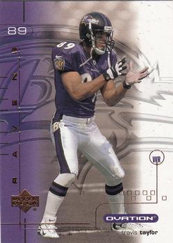
Thursday, November 2, 2017Set: 2001 Upper Deck Ovation (Rate) “ The embossing on the Ovation sets were always interesting. ” -Billy Kingsley
“ "Come on guys I'm open. I'm open. Did you hear me? I'm open! Pass it to me!" ” -YoRicha
“ I like it, it has substance. ” -carthage44
“ That's the same position our obstetrician took right before my daughter was born. ” -royals
“ Not one of my favorite Upper Deck products. Looks like it should be a screensaver. Same photo for front and back. Blech. ” -mkaz80
“ Pros: Ravens Cons: Never heard of the guy, busy design ” -IfbBirdsCards
“ Ovation? No thanks I'll sit. Poor front design the player name is the last thing you see, or maybe the team name. Nice team logo in background. Back minus tons of points for using same photo, plus you don't need photos on the back. Oh I think this was a high-end product. Back OK the card number is the last thing to see. Plus only one year of stats. Two thumbs down, at least. ” -captkirk42
“ I like the raised feel of this set. Pretty cool, I think. ” -cjjt
“ He looks pretty wide open. Throw him the ball! ” -switzr1
“ Nice design, but busy. All the Ovations I remember were pretty busy. I like the logo in the background. I hate using the same photo front and back. Pay the photographer to take a few shots next time. ” -kents_stuff
“ Watching the Ravens and this is the RCOTD to write about. Kind of funny. I don't mind this card, even though I feel I should hate it. There isn't anything special about it, but it isn't awful, probably because of the use of the team colors. Travis Taylor never amounted to much in the NFL, but a great college WR. The small name is awful! ” -muskie027
|

Wednesday, November 1, 2017Set: 2000 Milwaukee Journal Sentinel Brewers All Decades Team 1980s (Rate) “ Neat card. I like seeing these oddball regional or team issues. ” -olerud363
“ I like it! If only I was a Brewers fan I'd collect the set. ” -Sportzcommish
“ I love this card! There are a few nits I could pick, but overall I consider it to be very well designed. ” -dilemma19
“ When the Brewers used to be in the AL. ” -carthage44
“ Front too wordy. OK a card made by a magazine figures. Looks informative. But I won't be adding to my collection. Don't collect the team or the player. ” -captkirk42
“ Wow...all I needed to see were the (sun)glasses and I knew this was Jim Gantner. Talk about turning back the clock... ” -beansballcardblog
“ I like team issued cards. This is a winner with me. ” -switzr1
“ Overall I like it. Good general design, and unique (I think) with the name/position/uniform # in a diamond mid-card. I wish the back had just 80's stats instead of career, since this is an all-decades team. ” -kents_stuff
“ This and the others with images submitted are quite nice, especially for newspaper insert set. The in depth write up on the back is great. ” -rmpaq5
“ Different. I like it. Lots of info on the back. Picture taken by Journal Sentinel thus you know it is unique. ” -cjjt
|

Tuesday, October 31, 2017Set: 2017 Panini Unparalleled - Pink (Rate) “ one of the many parallels from Unparalleled. ” -trauty
“ A set called Unparalleled, so what is Card of the Day? A Parallel. That's hilarious! ” -Billy Kingsley
“ This looks like that nuclear volcanic lava card I got from the eBay the other day. Is the whole idea of unparalleled that they have 500 parallel sets? Or is it just the regular 75 that everything else has? ” -switzr1
“ This must be an unparalleled parallel. ” -deporcoruña
“ Oh that’s nasty. ” -IfbBirdsCards
“ Too much going on, and I don't like pink. ” -Sportzcommish
“ "Unparalleled" perhaps not the best name for a brand with 10 different parallel versions listed in the database. ” -bevans
“ Cards like this makes me hate that Panini has the exclusive rights to the NFL. BRING BACK TOPPS FOOTBALL PLEASE!!! ” -carthage44
“ This is what I would expect from 80's MTV ” -aussiewayne
“ ugh... I long for the days of a single parallel set or insert set.... ” -SFC Temple
“ Unparalleled. I would love to see a set that is unparalleled these days. Or maybe the design is unparalleled? That background is a bit hard on the eyes. You would think it's an 1980s design. This is the "pink" version? Well maybe they should have named the set Ironic. A parallel unparalleled. I think the time/space continuum imploded on itself with this one. ” -captkirk42
“ Whole lotta nope on this one. ” -parsley24
“ Pretty pink card. I like that there's a write-up on the back, but nothing else about it is very interesting. ” -dilemma19
“ Pink....as in Pepto Bismol......that's what I needed after looking at this card. ” -NJDevils
“ "HEY YOU KIDS, GET OFF MY LAWN!" This card is just way too busy for me. I do like that an OL gets a card, though. ” -beansballcardblog
“ Wow. Unparalleled? Unparalleled in what? Ugliness? The player gets lost in that absolutely horrible background. And pink to boot. To paraphrase Tom Hanks in "A League of Their Own", "There's no pink in football." ” -C2Cigars
“ The pride of Hillsdale College, my brother's alma mater. They take no government funding, but apparently can develop a giant Offensive Lineman. ” -royals
“ There's a football player in there somewhere.... ” -jayoneill
“ Looks Very, And I Mean VERY Colorful. The Pink and red mix together Like Bread And Butter. Very Nice Card 9/10. ” -Thomas555
“ Did a valentine explode on the front of this card? ” -kents_stuff
“ I took a look at this and thought it was from the 80s at first. That pink and garish design... Definitely not my kind of design. ” -wmcduff
“ Wow.....a lot going on there.... Why am I looking for Max Headroom? ” -Joshua825
“ I don't know if an uglier card could be produced. ” -WallyCub
“ At first I thought this was a Teen Bop magazine card, then I realized there was a football player on it. It would actually be pretty cool and I would say I liked it if it was some sort of breast cancer awareness card or if some proceeds went to breast cancer research. If it is pink for the sake of pink and another parallel set however, then oh my God how awful. ” -muskie027
“ It’s a breast cancer awareness card! Good for Panini! Wait. It isn’t? Oh, then it’s terrible. ” -Vvvergeer
|

")