
Random Card of the Day |
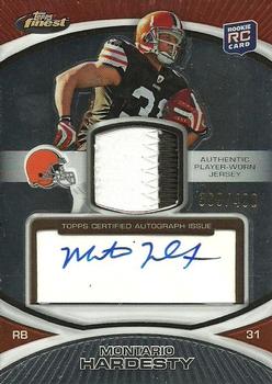
Saturday, August 26, 2017Set: 2010 Finest - Rookie Patch Autographs (Rate) “ Nice! I call this style card a "Triple Threat", meaning it has an autograph, relic (patch in this case) and Serially Numbered, all of which are things I keep track of on Excel for my collection. ” -Billy Kingsley
“ Second round pick out of Tennessee in 2010. Forced to sit out his rookie season after tearing his left ACL in his first pre-season game. Made NFL debut in 2011. Got hurt again before the 2013 season. Now an assistant coach at Florida Atlantic. ” -trauty
“ I feel like I have seen this similar design in about 140 memorabilia sets. At least this one is Auto'd. ” -muskie027
“ Autos. Threads. They don't do it for me. Together on the same card? A double-negative. ” -Sportzcommish
“ Another Browns draft pick bust. ” -carthage44
“ Wonder if he signed this from the hospital bed. ” -kirkscards
“ Nice looking card. Not a fan of artifact (GU, Jersey, Patch) cards never have been. Like the design, like the auto, prefer on card autos instead of these sticker things UGH. Back design is typical 2000 on up design. Back looks more like a Donruss or Panini back with the one line of stats. OK sure its a Rookie card but the stat totals look like he has two years worth of career stats, not just Rookie year. ” -captkirk42
“ I usually like Topps Finest products but I normally don't like jersey cards. Memorabilia cards were a neat idea at first, but if you notice the jersey is "player" worn; not "game" worn. He probably wore it while signing autographs. This is a balanced if rather dull card with the exception of the jersey swatch and autograph. The back looks good and has a decent player summary and stat section. ” -cnangle
“ nwueraksohkwllc. If you can read his signature, then you know what I just wrote. ” -NJDevils
“ Nice card ” -cjjt
“ Is there a player pictured somewhere on this card? Oh, wait, there he is. I had to get out my magnifier. Another example of how this hobby is moving away from "card collecting" to "memorabilia & autograph collecting". ” -C2Cigars
“ Nice scan! The back is really easy to read. ” -UKboogie
|

Friday, August 25, 2017Set: 1996-97 Ultra - Scoring Kings Plus (Rate) “ Is Shaq underwater in the Pacific Ocean? ” -rmpaq5
“ 1996-97 Ultra is my all-time favorite NBA set. This insert is probably the least flattering of the entire set. I still want to add it to my collection. ” -Billy Kingsley
“ So other than the word "Plus" printed on the back of the card, what's the difference between the "Scoring Kings" and "Scoring Kings Plus" inserts? They otherwise look identical based on the images here. Oh, and nice photos but lousy graphic design. ” -bevans
“ Funny looking card featuring Shaq's arm, with his body making a cameo appearance. ” -olerud363
“ What's not to like about Shaq? It's got a unique design. I've added this one to my Want List. ” -Sportzcommish
“ He is a big man. ” -carthage44
“ Too fancy for me. Reminds me of the Pacific now Panini Crown Royale fancy smanchy designs. ” -captkirk42
“ I normally like Fleer Ultra, but this card seems to have an identity crisis. It looks way to much like a flamboyant Pacific. ” -cnangle
“ A lot of wasted purple on top. I do love the perspective of the picture, the more I look at it, the cooler I think the concept is. I just wish it filled a little more of the frame. ” -muskie027
“ Nice!!! I love this card and miss the insert designs on the 90s. They felt as though the designer put time into them. ” -nubala
“ "Barbecue chicken!!!" ” -mkaz80
|

Thursday, August 24, 2017Set: 2014-15 Panini Adrenalyn XL UEFA Champions League (Rate) “ I think this is the first time a Swiss team has come up as card of the day. ” -Billy Kingsley
“ The randomizer just might need to be reconfigured. ” -trauty
“ I'm not going to make the disparaging comment about soccer gaming cards, but man the RCOTD bot does love them! ” -rmpaq5
“ With all due respect to soccer fans, stop with the soccer cards! This is America! Football requires the use of hands. ” -Sportzcommish
“ Way past his prime. I'm surprised to see he was still playing in 2015. ” -deporcoruña
“ SOCCER!!!!!! Another one!! This must be some kind of record. WHY do all the soccer cards have a bunch of symbols nobody understands. Is this some sort of "game" card?? ” -RoyalChief
“ Chalk up another Soccer TCG RCotD! Wow this is too crowded and confusing for a dang card game in my book.Does it use both sides. Like I said confusing. ” -captkirk42
“ Please stop with these. ” -carthage44
“ The soccer haters are not going to like this! It could use a yellow circle with a 56 in it to make it perfect. ” -UKboogie
“ I don't have anything nice to say, so I'll keep quiet. ” -dilemma19
“ Soccer! Love the game, do not understand the cards. ” -cnangle
“ Yet another soccer game card. Maybe the card generator is stuck. ” -IfbBirdsCards
“ How much crap can you fit on a card? I don't know, let the soccer game cards figure it out through trial and error! So far, lots of error. ” -muskie027
|

Wednesday, August 23, 2017Set: 2008 Upper Deck - StarQuest Rainbow Red (Rate) “ I own one card from this set, but it's only because I collect the player's cards. Otherwise there's really nothing that moves me here other than onto another page. ” -Sportzcommish
“ I bought a case of the 2008 Upper Deck years ago and really enjoyed them. ” -carthage44
“ Not for me. The emphasis should be on the team and the player. Had to get my magnifying glass AND tilt my head to read who it was (sarcasm). ” -RoyalChief
“ Starquest. I'm still sort of on the fence about them. When I first started seeing them I was so turned off by them. I don't mind them so much now but will only consider my Homie teams when collecting them. If I chase any of them. ” -captkirk42
“ I love these cards!!! I wish Upper Deck (And more so Topps) still made NFL cards. How long does Panini hold the rights for again? These were pretty easy pulls but they always made me feel like I got something special. ” -nubala
“ Vividly remember entering those codes on the back of each card for a few years on Upper Deck's Kids website. Eventually they stopped doing the individual cards and just did one code on each pack, which lost a lot of the allure for me (as did growing older). But using those codes for virtual and physical rewards certainly got me as a kid buying and asking for Upper Deck products as opposed to Topps or whoever else was on the market. ” -jasongerman9
“ Nice scan! I can easily read the text on the back and I'm old! Same picture front and back and horrible design with the background removed? Panini congratulates you Upper Deck! ” -UKboogie
|
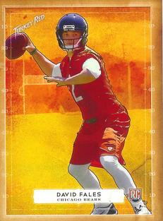
Tuesday, August 22, 2017Set: 2014 Topps Turkey Red - Mini (Rate) “ I'm guessing there's going to be a lot of Fales/Fails jokes, but I like it....to a degree. It's bright, which I like. It's a player in front of a computer generated background, which I don't. ” -Billy Kingsley
“ Woah. So much yellow and orange! Scrimmage in the middle of the sun??? ” -olerud363
“ Fales was a fail. ” -carthage44
“ Let me put on my shades then I will comment. ” -NJDevils
“ I like Turkey Red a lot. I am very tired of minis though. I used to love the minis but like the practice of super short printing base cards I am very sick of it. OK I am also tired of the RC logo. I guess they have to identify rookie cards somehow but the popularity of RCs and more so Prospect cards (sort of Pre-RCs) I am super tired of. Back to this card. Looks a bit bright. I thought it might be an orange parallel but it seems all the cards are this kind of bright sunny design. Back OK for Turkey Red. ” -captkirk42
“ Neat card. Unfortunate last name. ” -mkaz80
“ Oh look, Topps was putting their Twitter handle on cards way back in 2014! ” -jasongerman9
“ I like Turkey Red... But this just does not look right. ” -nubala
“ David Fales didn't realize the real reason everyone went long was do to the yellow and red cloud of Death that was creeping onto the field, nor would he ever.... ” -YoRicha
“ The only time I have seen Turkey Red is on RCOTD. I don't get it. Is this David Fales rising from the ashes like a phoenix? Is the town behind him on fire? Something isn't right. ” -muskie027
“ Looks like it's on fire. ” -trauty
|
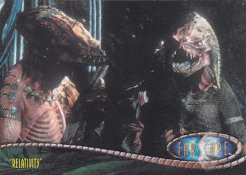
Sunday, August 20, 2017Set: 2002 Rittenhouse Farscape Season 3 (Rate) Card: #177 Aeryn appeals for Talyn's life, but Xhalax “ Shouldn't this be listed as "Relativity" instead of the beginning of the sentence on the back? ” -rmpaq5
“ "Hey sweet thang, what's your sign?" ” -YoRicha
“ Put a helmet or a jersey on them and maybe I'm interested. ” -Sportzcommish
“ I've never seen Farscape, but it looks like a good laugh. ” -DanD
“ I don't know what this is, but it made me laugh ” -switzr1
“ I was just thinking about this card the other day! (No I wasn't.) ” -mkaz80
“ Cool another non-sport card. Very odd even for "Farscape' I guess I didn't see enough of that show to recoginze those guys. Nice card BTW. ” -captkirk42
|
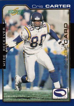
Saturday, August 19, 2017Set: 2000 Score - Scorecard (Rate) “ Not bad! I like the border. ” -Billy Kingsley
“ Former Buckeye, and Hall of Famer. Winning card in my book. ” -Brimose
“ I really like this score set. My brother is a Vikings fan and Carter was one of his favorites. I can overlook that this is actually a parallel and say, Good Card. ” -switzr1
“ The score sets were always cheap but were full of parallel cards like this one. ” -carthage44
“ Cards like this from the late 90s to early 2000s make me both nostalgic and disgusted simultaneously. ” -DanD
“ Nice card by score. I'm sure at one time I groaned about it just because of the time it came out and was during my non-updated days of collecting. ” -captkirk42
|
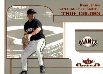
Friday, August 18, 2017Set: 2002 Fleer Maximum (Rate) “ Very plain, and I don't remember this player at all. ” -switzr1
“ This design was used for the rookies in the NBA set. I liked the base card design better. ” -Billy Kingsley
“ Ironic that a True Colors card is grey & white for the majority . ” -uncaian
“ Minimum interest. I don't get the series name nor the subset name and to make matters worse for my taste it has a Paninian-influenced photo on the back. ” -Sportzcommish
“ The fall of one of the 80's and 90's card giants. Also, when have the Giants ever had beige as a true color. ” -IfbBirdsCards
“ Boring! ” -carthage44
“ No wonder this design was never rehashed as part of any "retro/heritage/archives/legacy" set. Aside from the ballpark image (not team-related - same one on every card), there is nothing redeeming about it. If I'm pressed to say something positive, at least the font is large enough to be legible. There. I tried. ” -dilemma19
“ An OK card. Nice and simple but almost too complicated. Even though I like it there is something that doesn't see right. Not sure why. Maybe too dull looking? Back is OK ” -captkirk42
“ Same drab designs they've always had. ” -RoundtheDiamond87
“ Well I was not collecting Baseball back in 2002 so I had to research this set a bit, I found it was a very unpopular set? I don't think it looks all that bad, in fact, I kind of like it, however, the Rookies lack, and this is even with a 500 print run. Maybe because this was a slow rookie crop that never really got over? Who knows why a set will get released and fall from grace not 12 days after release? If I had to rate this set I would give it a solid 6/10 I like it, not love it, but I do like it. I will now look to buy one....Take care all ” -The House Of Cards
“ Future Kansas City Royals pitcher. ” -trauty
|

")