
Random Card of the Day |
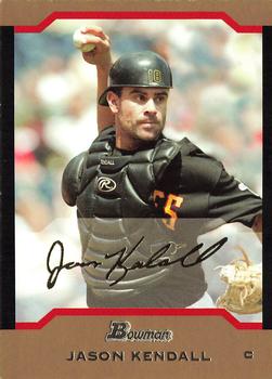
Sunday, September 17, 2017Set: 2004 Bowman - Gold (Rate) “ I was on a road trip hitting various major and minor league games back in 1999 and made a stop in Pittsburgh...and was at the game he snapped his ankle. One of the most surreal memories I have. ” -rmpaq5
“ Not bad, not great either. ” -DarkSide830
“ These cards are too thick. ” -carthage44
“ Bowman, with the fake signatures, would look better if that section of the card wasn't "faded" to make the signature stand out. I'm glad they finally did away with it all and dropped the fake autos in recent years. Young players weren't taught cursive in school anyway, and don't know how to write a proper signature, so I don't even want their autograph, real or fake. ” -switzr1
“ I remember buying several blasters of this back in the day. I don't like the gold cards mostly because they are thicker than the base. Not a fan of that. ” -mkaz80
“ Kind of plain, but nice card overall. Back looks great. ” -Doc Floyd
“ The chamfered tab look is eye-catching yet not distracting, and gives some freedom for photo choices (especially well illustrated in this example with the ball above his head). But I am really not a fan of any black border anywhere on the card. It makes it so hard to keep them display worthy with almost any handling whatsoever. It looks like this particular example likewise suffers from that, especially on the right edge. Otherwise I like the design, though. ” -kents_xtras_trd_sell
“ A team logo would have made this a very nice card ” -NJDevils
“ Is it me, or does he look like Colin Farrell? ” -YoRicha
“ Love some of the color parallels! I think I missed this set somehow..... ” -Joshua825
“ Oddly I like the 2000s era of Bowman designs. I can't stand their numbering for the prospects and rookie prospects and prepreprospects with the PP and DP and DCPPPCDs and whatnots that they do. Like this design and even the "gold" variant that we see here. Back is OK as backs go. ” -captkirk42
|

Saturday, September 16, 2017Set: 2016-17 SMG Ntreev Superstar Black Edition (Rate) Card: #SBCBK-067-N Ji-Hyuk Ryu “ Not too bad, a little too much wasted space on the bottom. Why is the team name in standard alphabet while everything else is in Japanese? Looks like he racked up 10 Q-bert signs in the season reported. I wouldn't mind collecting one of these sets. ” -muskie027
“ An absolutely attractive card until one sees the resemblance to Panini on the back, i.e. same picture (just cropped and enlarged). Is SMG a subsidiary of Panini? ” -Sportzcommish
“ I can kind of figure out the stats on the back. ” -carthage44
“ I could do with collecting a few KBO/NPB cards. Among Doosan's most notable players is that bum Hyun-Soo Kim. (whom i used to like, but now realize is just a terrible player) ” -DarkSide830
“ Now that's cool. Something I have not seen. ” -RoyalChief
“ Cool, but why is everything but his name in English? It's like collecting OPC! ” -switzr1
“ "It,s going, it's going it's....Mmmm that stadium dog looks delicious." ” -YoRicha
“ I like the writing going along the side and towards the back of the batting helmet. I found out that the Doosan Bears were founded by a brewery back in 1982, and were known as the OB Bears. That's cool. Excellent card!!! ” -CollectingAfterDeath
“ Nice NBL? (Nippon Baseball League?) card. ” -captkirk42
“ Not much I can read on it, and never heard of the guy, but it still works. The only thing I don't like is what I'm guessing is only one season of stats. Awesome looking card. ” -Doc Floyd
“ I like this design. Good picture too. ” -IfbBirdsCards
|

Friday, September 15, 2017Set: 2003 Fleer Tradition - Throwbacks Memorabilia (Rate) “ I still like relics...even for football. ” -Billy Kingsley
“ Somewhat boring. ” -muskie027
“ In general this typifies an excellent card with an action photo that is not cluttered with other players, and a design that includes player, team, and card company logo. What I'm not too keen on is the patch. Maybe if it only occupied a slender space as a banner I'd be fine with it. ” -Sportzcommish
“ Nice design, except for all the yellow. ” -olerud363
“ Too bad its not in red. ” -RoyalChief
“ These Game Worn jersey cards should be more valuable than the jersey cards that the players wear for a few hours at an event. ” -carthage44
“ The front of this "relic" card would be better suited as a regular base card. The jersey swatch should be centered. I also find it quite humorous that a black piece of "Throwback" jersey for the Raiders. Now I don't mind the back so much since it serves it purpose for a relic card. I do however think that from day one all relic (jersey, Game Used whatever you want to call them) cards should be serial numbered. IN the early days they rarely did that, even today many relic cards are not serial numbered. ” -captkirk42
“ I like the front of this card, The relic is a focal point, yet it doesn't detract from the player photo. I like the white photo frame, but maybe the name and team should have been printed in black. Apparently Allen is an "NFL legend", but Fleer couldn't even write *one sentence* about him. ” -dilemma19
“ I like it! Great image, simple design... ” -nubala
“ Watching him run over the Redskins in the Super Bowl is one of my best memories from the 80's. ” -rmitchell6700
“ Never was a fan of "Game worn" anything. Too, too gimmicky in my humble opinion. ” -YoRicha
|
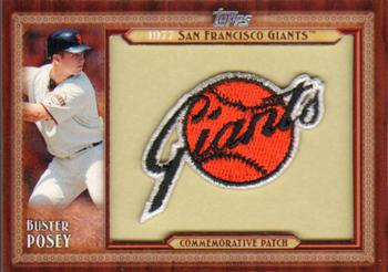
Thursday, September 14, 2017Set: 2011 Topps - Throwback Logo Manufactured Patch (Rate) “ I know I'm apparently one of the few, but I actually like manu-patches. To me, they are just a different card material...I already have paper, plastic and metal, why not cloth? ” -Billy Kingsley
“ Cards like this are clear signs of too many cards being released. It looks sharp, but would be more collectible if the manu-relic had some relevance to the subject. Posey probably wasn't even alive in 1977. ” -dilemma19
“ Hopefully my first comment that got cut off doesn't get posted. I'm doing this from my phone and got sidetracked. I believe these cards were inserted one per blaster. I know some may not consider this a memorabilia card, but unfortunately my dad does, meaning I have yet to successfully trade for this card from him. That being said, if anyone has an extra one of these for trade I would love to work something out! ” -jasongerman9
“ Gotta love the throwback. ” -RoyalChief
“ These were only available in retail packs which were really nice cards to get in a retail packs. ” -carthage44
“ Has the look of a framed picture. I like the logo. Very nice. ” -CollectingAfterDeath
“ Manupatch. Normally I don't like them, but when they are a logo or a good design they are OK I guess. ” -captkirk42
“ Sweet. ” -Doe MG
“ I actually enjoy these manufactured patches. If only there weren't a billion of them. ” -suomibear8
“ Pretty scugly looking card. Not really a fan "manufactured" memorabilia. Nope. ” -AnalogKid
“ These are the nicest logo cards I've ever seen! I'm adding some to my Want List now! ” -Sportzcommish
“ I really don't like it. This is just creating stuff for the sake of putting out stuff. ” -muskie027
|
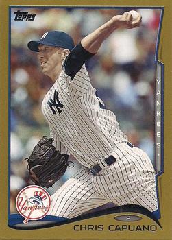
Wednesday, September 13, 2017Set: 2014 Topps Update - Gold (Rate) “ I love serially numbered cards. I think it's an addiction. I've got more than 3200 for the NBA alone, and I have hundreds in NASCAR, and a handful in everything else. Yes, I even have baseball and football SN cards! Whenever I get some money in COMC, I usually go to the SN listing and pick off as many cheap ones as I can until I run out of money. It doesn't matter who is on the card, as long as I don't already have a copy. ” -Billy Kingsley
“ I like the gold enhancement, but I prefer their original base set design as one of their best ever. ” -Sportzcommish
“ Since Topps flagship has gone borderless the past two years, "gold" cards haven't been the same. Too bad; I always enjoyed collecting these parallels. ” -mkaz80
“ I love the photos like these. Pitcher about to release the ball. Some of the best faces you will ever see. ” -RoyalChief
“ I followed this guy because he was once a Met. This is a nice-looking card, even if he's playing for the wrong NY team. ” -NYMHall
“ I think these cards need more wavy lines. ” -carthage44
“ Great card! Good photo, great back, and it's Topps. What more could you want? ” -cnangle
“ OH a modern Baseball card had to ruin the Random Card party. LOL. OK so this is the Gold parallel. I prefer this kind of parallel than those subtle only 12 year old kids and those with 20/20 vision can tell the difference parallels. They really shouldn't give parallels serial numbers, even the cute numbered to the year the cards were issued in. ” -captkirk42
“ Can't go wrong with a gold border. Would have looked better as a Jonathan Schoop card, imo. Go Orioles!!! ” -CollectingAfterDeath
“ The gold cards are nice, but I find it annoying they go up in serial numbers every year. ” -IfbBirdsCards
“ I forgot Capuano had a stint with the Yanks until this RCOTD. Not a bad card. ” -muskie027
|

Tuesday, September 12, 2017Set: 1974-75 O-Pee-Chee (Rate) “ I love old cards! ” -muskie027
“ Cool! Now that I'm collecting hockey I really like this card a lot more than I would have a year ago at this time. 74-75 OPC is a set currently missing from my collection, but it won't even be 9 months for me in the hobby until a couple of days after this sees publication (1/15/17 is when I began actively collecting the NHL) ” -Billy Kingsley
“ This is maybe the coolest hockey card I've ever seen. I wish goalies still wore those masks. ” -switzr1
“ Fantastic design that shouts, "Hockey!" I truly was impressed with this and the use of the stick within the design is truly outstanding. ” -Sportzcommish
“ I love this card , one of few I had as a kid , hard to find mint. Nice set. ” -uncaian
“ The goalie gear was so minimal back then. My 7-year-old wears a chest protector that's bigger than that. Nice to see some vintage hockey in RCOTD. ” -olerud363
“ Never really followed hockey that close, but collected these cards. ” -kirkscards
“ Great card. Nice logo and photo. Of course, no one ever knows what he looks like. Could be AvsBruins behind the mask. ” -NJDevils
“ Well, I spit my coffee out when I saw that. Nightmares tonight for sure. ” -RoyalChief
“ I absolutely LOVE the old Friday the 13th goaltender masks! ” -carthage44
“ The good ol' day!. As a kid I would have loved this card! I don't do hockey anymore but if I did i think I would have to have this set. ” -cnangle
“ What you don't see is Mr. Gilbert sticking his tongue out at all of you people trying to thing of something clever or witty to say about the RCotD. Oh yes, even back then he knew about RCotD. ” -YoRicha
“ Yes Vintage Hockey OPC to boot. Goalie in full gear and mask plus plus. 1974 was when the Capitals started I would rather one of their cards had been picked. ” -captkirk42
“ Wicked mask! Well balanced and nice color combination on the front. I like it! ” -CollectingAfterDeath
“ This is one helluva hockey card! ” -mkaz80
“ Gotta love the classic Jason style goalie mask. ” -IfbBirdsCards
“ Today's goaltenders are protected better than a SWAT Team member. Look at the equipment they used to use. ” -rmpaq5
“ Yikes! Don't go near the lake if you see him! ” -Joshua825
|
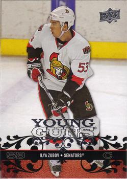
Sunday, September 10, 2017Set: 2008-09 Upper Deck (Rate) “ I don't know why but I tend to favor the players who have a last name that starts with Z...also Q, Y and U. If my sports, which now includes hockey, ever get somebody that starts with an X, I'll be collecting them like crazy! ” -Billy Kingsley
“ Would look a lot better with all that mess at the bottom about half the size it is. Back is weak. ” -Doc Floyd
“ I possibly understand the attempt to resemble the design on pistols, but it doesn't work on the card. It looks rather feminine in some respects. ” -Sportzcommish
“ Not a bad card , nothing too flashy, gets the job done . Zubov was a great prospect , but only played in the NHL for ten games. ” -uncaian
“ I wish Upper Deck wasn't so cheap and still was able to produce Football and Baseball cards. ” -carthage44
“ 1/3 of the front ruined with the trash script. ” -NJDevils
“ Don't really like the scroll pattern on the bottom of the front of the card.The back is pretty dull too. Also not a fan of semi-pro cards in any sport. Add that all up and I won't be looking to add this card to my collection. ” -cnangle
“ Nice looking card. Helped by the fact that the Sens logo is absolutley tremendous! ” -mkaz80
“ OK card, they got a bit carried away with the design on the bottom. Back OK since he is a "young gun". ” -captkirk42
“ Not sure if I like this or not. Looks too...I don't know, but too something. ” -muskie027
|

Saturday, September 9, 2017Set: 2016 Topps MLB Wacky Packages - Green Turf Border (Rate) “ I love these. The juvenile humor makes me feel like a kid again. ” -Doe MG
“ I know these are suposed to be fun and all, but... So corny. I'll pass. ” -mkaz80
“ Saw a series of these for sale at the dollar store. The kid in me keeps me collecting, but I'd have to go back in time and be a kid again to be interested in these. ” -Sportzcommish
“ Haha. That is all. ” -RoyalChief
“ Yes, head shavers! ” -carthage44
“ Wacky Packages are always fun, loved getting packs of those. ” -702tpr777
“ In general I am actually quite fond of parody cards. I am quite fond of Major League Baseball. San Diego Padres are my favorite baseball team. This card just hurts my feelings because it isn't really that humorous. ” -YoRicha
“ OK, I guess. While I like Wacky Packages, like everything else they do, Topps has got to run it in the ground. ” -Doc Floyd
“ I have no words. ” -Brimose
“ No thanks. I just don't find these funny. At all. ” -switzr1
“ Ah Wacky Packages. I loved them back in the day (the 1970s), In the early to mid 80s when they made a sort of return with the smaller sized stickers with the album I was sort of for it. Then in recent years they have made some retro and reprint sets that I am not that into. So this is last year's attempt to relate them to the baseball teams. I recall Topps inserted them into the regular card packs. I think one of the major differences were the originals many of the jokes/products were truly funny and just tacky enough to be enjoyable, and the newer stuff just doesn't seem that original or that funny. I think it would have been better if instead of trying to make MLB related wacky packages they just came up with some parody team names. Like that custom Star Wars set where the matched the MLB teams up with some Star Wars creatures or organization. ” -captkirk42
|
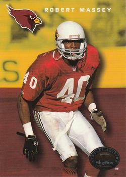
Friday, September 8, 2017Set: 1993 SkyBox Premium (Rate) “ I don't get the weird color thing this set has going ” -switzr1
“ Not the worst set and pretty decent for and early 90s set. ” -nubala
“ Looks like he was sitting on the bench only it was photo-shopped out. ” -NJDevils
“ For my money, the back of this card is done perfectly. Large image (that is different from the one on the front), copious career notes, and full career stats. ” -mkaz80
“ I used to like the sun on the sleeves of the Cardinals jerseys back in the day. ” -RoyalChief
“ Skybox usually made good sets. This looks solid, gets the job done.The back actually looks a bit better than the front though. ” -Doc Floyd
“ Skybox was always a "less-than" product for me. No matter what their card design was for the year, there was always two or three sets that were better. ” -cnangle
“ Nice color. ” -cjjt
“ Skybox always had weird backgrounds. Because it was their thing, I liked it. I generally don't. I remember really liking that first NBA set they put out. ” -muskie027
|

")