
Random Card of the Day |


Wednesday, September 2, 2015Set: 1997-98 Collector's Choice (Rate) “ My least favorite of the Collector's Choice sets, for the sole reason that the number is too darn hard to read! Even in person it's miniscule. I have this same design in both NASCAR and Hockey and the numbers are larger in both...so not sure what UD was thinking when they did the NBA set. ” -Billy Kingsley
“ I don't usually like the Collector's choice designs, they usually all look alike and are generally boring. This one is a nice variation from the usual boring theme. ” -captkirk42
“ My first thought...AWKWARD. I like the card design, it doesn't overpower the subject...the player. ” -C2Cigars
“ This was the first Collectors Choice design that I didn't like. I always found the font used for the name hard to read. ” -switzr1
“ I normally wouldn't comment on a basketball card, but had to make mention of a former player from my alma mater, Seton Hall University in South Orange, NJ- Terry Dehere. Dehere was from the last great run of Seton Hall teams under coach PJ Carlesimo, including the one that was robbed of a national title by Michigan in 1989. A New Jersey schoolboy standout, he played for Bob Hurley, Sr. at St. Anthony's in Jersey City and remains in the area to this day. ” -Dave Sosidka
“ 1996-97 Clippers were a playoff team. Love me some 90s Clippers! ” -wax_house
“ That's an awkward looking rebound! ” -cckeith
“ Nice action shot! ” -carthage44
|
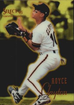
Monday, August 31, 2015Set: 1995 Select Certified - Mirror Gold (Rate) “ Several things: Great scan! Well-marked parallel. Stats indicate this was obviously pre-Interleague play. (I miss those days.) Considering this release was in addition to other releases by the same company, I can understand the different way of reporting stats (and the fact that it only shows the one year). ” -vrooomed
“ Very poor attempt here by Pinnacle. ” -carthage44
“ Another 90s product I don't like. ” -captkirk42
|

Sunday, August 30, 2015Set: 2007 Topps Turkey Red (Rate) “ I like this design. It looks old while still having a modern depth of field. The border looks three dimensional but I don't believe it is. Really well done effort by Topps here. ” -Billy Kingsley
“ I actually really like the Turkey Red Sets.They are not overdone design wise.Write ups on the back are well done too. ” -uncaian
“ Looks like s straight up picture frame you would hang on the wall. ” -carthage44
“ The original 1911 Turkey Red T3 Cabinets are beautiful. These "retro rip-offs"...NOT!! By the way Topps, this design was used for boxing not baseball. And stop using other company's designs. ” -C2Cigars
“ why? yuck! ” -SaveDaKid
“ I like Turkey Red. Don't like horizontal or Landscape cards but it works for this one. ” -captkirk42
|

Saturday, August 29, 2015Set: 1991 Topps The Addams Family (Rate) “ I know I saw this movie, but I have absolutely no memory of it. ” -Billy Kingsley
“ One of the better movie sets; decent graphics on front and colorful, back with awesome description. ” -SFC Temple
“ I actually like this card it's ooky,kooky & just a little spooky! ” -uncaian
“ I have an unopened box of these, but as I have never seen the movie, I won't open until I do. Gut feeling, with my love for the original series, is that I will be disappointed with the movie! ” -bkklaos
“ dadadadun *snap* *snap* dadadadun *snap* *snap* adadadadun, dadadadun, dadadadun. The Adams Family Love it. Still think Christina Ricci is hot. ” -captkirk42
|


")