
Random Card of the Day |

Friday, October 17, 2014Set: 1994 Donruss - 90's Dominators: Batting Average (Rate) “ Nice insert design. Simple yet effective. ” -Billy Kingsley
“ This guy has a pretty long rap sheet. ” -carthage44
“ Lenny, Lenny, Lenny. We loved you in Philly. How far you fell. As for the card itself, Not bad for an insert. ” -vrooomed
“ Decent set, wish I could have pulled more of the inserts. ” -Joshua825
“ I love how the '90s only ran til 1993. This subset would have made more sense had they waited until 2000 to put it out. Oh well, maybe they were afraid he wouldn't play into the new decade. ” -yokonashiwa
“ If you couldn't tell it was from the 90's because it says "90's" on it, you could certainly tell it by the oversized "D" and "S" in "DOMINATORS"... ” -revnorb
“ The Phillies uniform font needs a serious upgrade. ” -jlaz10
“ I like sets like this, where the players are included for a specific reason, like top ten batters of the decade. Nice looking set too. ” -switzr1
|
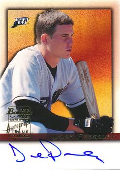
Thursday, October 16, 2014Set: 2001 Bowman - Autographs (Rate) “ Always better to have an on card auto than a cheap sticker auto. ” -carthage44
“ I started at bananas, now I'm here ” -SFC Temple
“ Never made it to the majors, although he skipped the Class A short season team that plays a mile from my house. (Went from Rk to A). This was probably a tough pull back then. Nice looking autograph issue. Looks like it's on-card and not a sticker. I prefer that. ” -vrooomed
“ Don't remind me of the rainbow-Rays. ” -jlaz10
“ Never heard of him but like the color background. ” -Joshua825
|

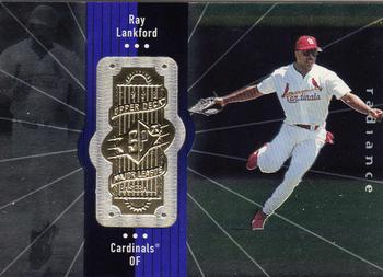
Tuesday, October 14, 2014Set: 1998 SPx Finite - Radiance (Rate) “ I remember when the NBA version of this set came out- it was the first set where every single card was serially numbered. It was a fun set to do, and over the years I did two boxes of it. The Radiance parallels and the Spectrum parallels are pretty nice too. They just don't scan very well. ” -Billy Kingsley
“ I LOVE THESE CARDS! Every single card (even base cards) are serial numbered. These card were way ahead of their time. One of my most prized possessions is being able to complete the 1998 SPx Finite football base set. ” -carthage44
“ This is one of my favorite sets! I love that most of the set is numbered which is why I try to get as much as possible! ” -Joshua825
“ Another confusing "set" to compile. We tried to piece together the hockey version. What a pain. Also, the SPx logo is the focus of the front, instead of the player photos. One of the worst products Upper Deck ever issued. Quite possibly the worst. ” -vrooomed
“ I suppose someone will like this. Not this someone ” -NJdevils
“ Another uniform in the transition period between high cuffs and pajama pants. You can tell a) by the year and b) by the tighter pants but no visible sock. ” -jlaz10
“ This looks more like Broadway musical than baseball game. ” -uncaian
“ Another Cardinal. Awesome! Seems they were hurting for set names in 1998 though. Not sure what SPx Finite means. ” -switzr1
|

Monday, October 13, 2014Set: 2013 Panini Road to 2014 FIFA World Cup Brazil Stickers (Rate) “ Considering how popular this sport is worldwide, you'd think they would get more real cards, instead of just stickers and playing cards. Is card collecting only popular in North America? ” -Billy Kingsley
“ Sebastian made this set which was put out the year before the World Cup. Sadly though he was not chosen for the Azzurri in Brazil. ” -Gunny
“ Decent looking product. Wish the front showed the sticker number as well as the back, but that's a minor gripe. I don't get the blob shapes. Anything wrong with circles for a sport played with a sphere? ” -vrooomed
“ For a World Cup that was hyping multiple colors on TV, Panini went the cheap route and did the back in black and white. Probably saves them a penny per card. ” -NJDevils
“ I wasn't a fan of Puma's kits for the most recent World Cup. The shirts were way too tight. ” -jlaz10
|

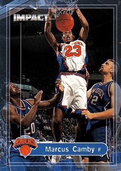
Saturday, October 11, 2014Set: 1999-00 SkyBox Impact (Rate) “ I really liked this set when it came out, and I still do. Wish my scanner didn't put lines on some cards, as visible in the background on this one. He played until 2012-13, and hasn't officially retired although NBA teams are not calling anymore. Injuries hampered his career on a near constant basis, but when he was able to play he was one of the best defenders in the League. ” -Billy Kingsley
“ This guy seemed to play forever. ” -carthage44
“ The great thing about basketball cards is who is in the background on the action shots. You can have a common card with a big star right next to the common guy. ” -NJDevils
“ I really like this design. Too bad it's a Knick. ” -switzr1
“ The Knicks with black was a horrible idea. With both the Knicks and Mets going back to pure blue and orange, life is better. ” -jlaz10
“ Looks like he plays for a team called The Impact and is being boosted to the rim by the defenders. ” -revnorb
|


Thursday, October 9, 2014Set: 2011 Topps Heritage Minor League (Rate) “ Woody! ” -carthage44
“ Great picture! Great card. I love some of these old card designs. ” -cckeith
“ I got this set for my son because he loves the 1962 cards so much, and I could afford this one, not the 1962s. (He also likes the 1987 set, I have bunch of those!) ” -vrooomed
“ Doesn't do the 62 Topps any justice.... ” -suomibear8
“ One hop this time! ” -DaClyde
“ Topps really hit the spot with this minor league set. Yes, it's a copy of a major league set that was brought back from 1960, but it's not a bad design. ” -jlaz10
“ I never see the Heritage minor league sets for sale around here. I've picked up some singles online, but would like to collect some of these without buying a whole box. I love going to minor league baseball. ” -switzr1
“ I enjoy the Topps Heritage Minor league sets as it offers me opportunities to acquire minor league cards I enjoy collection. ” -koloth42
|

")