Random Card of the Day |
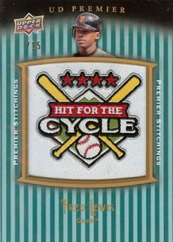
Thursday, February 20, 2014Set: 2014 Topps - The Future is Now (Rate) “ The first 2014 card to come up as Card of the Day...not sure what the "Check out the Wheels" tagline means, but the card design is pretty good. ” -Billy Kingsley
“ wpw, a 2014 already... ” -lyfestory
“ I don't know what it's called... the embellished photo. I understand they are trying to enhance the pic, but it just seems tacky to me. No logo = BOO! ” -SFC Temple
“ Now. You're looking at now, sir. Everything that happens now, is happening now. What happened to then? We passed then. When? Just now. We're at now, now. Go back to then. When? Now! ” -UNC_Samurai
“ One of the better inserts that I've seen or should I say "haven't seen". Either way, nice job. ” -NJDevils
“ Many people don't realize that this uniform set was first worn by the then-named Anaheim Angels in 2002. ” -jlaz10
“ Wow, that took less than two weeks to make RCotD, that has to be a record! ” -jackal726
“ The future is in fact here 2014 on the big board...let your trout hang out... ” -SaveDaKid
“ WOW! What a quick turnaround for a set out for a couple weeks. ” -jupiterhill
|
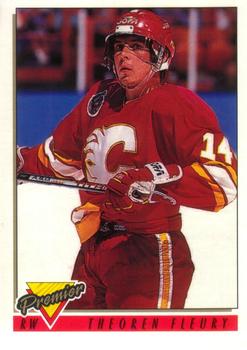
Wednesday, February 19, 2014Set: 1993-94 O-Pee-Chee Premier (Rate) “ Is there any 1990s design that doesn't look good? I don't think I've seen any! ” -Billy Kingsley
“ One of hockey's "best little big men" ,this was a nice set too. ” -uncaian
“ A man who looks like he's wearing a European motorcycle cop's helmet and is dancing with a cane like Fred Astaire plus a logo that looks like a large cheese wedge! What's not to love? ” -revnorb
“ Photo taken seconds after learning he was named after Theo Huxtable. ” -NJDevils
“ Couldn't they have taken the picture after he had finished dressing?? ” -yokonashiwa
“ The Flames have never looked better than their original red and gold. Black is a little too much ” -jlaz10
“ This is odd ” -Hollywood42
“ As a fellow little guy, I admire players like Fleury and Martin St. Louis and their ability to succeed in a sport dominated by men with much bigger frames. ” -DanD
|
Tuesday, February 18, 2014Set: 1978 TCMA Tidewater Tides (Rate) “ Tidewater Tides...that's not very creative. ” -Billy Kingsley
“ I love the big ol' photo with the tower-thing in the background, it reminds me of that 1960's Joe Kapp photo that wound up on about five different NFL and CFL cards in the 60's; the first year they ran it it had a similar structure in the background and they just kept airbrushing more and more of the background out as they reused the picture year after year. ” -revnorb
“ Loved him on the TV show "CHiPS".. ” -wamk
“ I like the simplicity of the cap. A simple orange T on blue ” -jlaz10
“ Looks like "Be On Your Own Baseball Card Night" in Tidewater again! ” -DaClyde
|
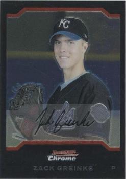
Monday, February 17, 2014Set: 2004 Bowman Draft Picks & Prospects - Chrome (Rate) “ A young Zack Greinke. Nice posed picture. His autograph looks like it reads Jil Quiche. Great looking card. ” -yokonashiwa
“ Chromes just don't scan very well.. One thing i don't like is how they warp unless they are kept tight in a box, and even then they can stick together.. Always enjoyed the Chrome line, but their production needs work.. ” -lyfestory
“ Why do they insist on the fake autographs? (At least, I think it's fake, if not, I'll shut up...) ” -Billy Kingsley
“ I never liked the black Royals hats. It never seemed to fit their color scheme. ” -jupiterhill
“ the black border cards take away from the pic, in my opinion. I'd also like to see the players' names take precedence over the brand name, unlike this offering ” -SFC Temple
“ Greinke was a punk then as he still is one now! ” -PDIZZLE
“ Geez, looks like something you would see next to a casket. More fitting for an Abe Lincoln card. ” -NJDevils
“ I like his menacing look on the back photo. It reminds me of the bagger at the grocery store last night when I told him I didn't need any help carrying my bags to the car. ” -jackal726
“ Chrome cards - Tough to scan but nice in hand. Wouldn't mind if this was in my collection, but sadly, it's not. ” -vrooomed
“ Greinke and Kershaw. Baseball's best right hander and left hander ” -Young Kilo
“ They're the Royals, not the Blacks. Wear blue, for goodness sake. ” -jlaz10
|
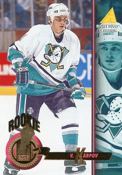
Sunday, February 16, 2014Set: 1998-99 UD Choice - Prime Choice Reserve (Rate) “ I really like when companies use the same designs for all their sports in the same year. This is either a level 2 or 3 parallel, but it's done differently than the NBA version of same, which did not have words going up and down in the background. At least, if it's a level 2 parallel, I don't remember if the NBA had a level 3; if they did, I never got any. ” -Billy Kingsley
“ This card just looks like a kid scrawled all over it. Interesting to see a design I remember from baseball transferred over to hockey, though. ” -Luckynumber78
“ A big reason why I don't care for parallel sets is ones with little effort like this. ” -DanD
“ Decent front, again would be nice to have the team logo. Oh, and remove the ghost "choice reserve" from the front. It detracts. Back would be better with a larger number for us old guys. ” -NJDevils
“ This was a nice looking & affordable set for collectors.Turgeon is one of the best. ” -uncaian
“ They have the logo on the back, why not the front? OK action, at least he isn't just standing there with his stick in his hand. ” -SFC Temple
“ Nice set, nothing great about it. This particular parallel was a bit lame back then and is even more now. At least they were serial numbered. ” -vrooomed
“ I know it's a parallel, but that watermark text on the card is annoying ” -Hollywood42
“ The Blues looked best in simple blue and gold. No red, no navy, just royal blue and gold. ” -jlaz10
|
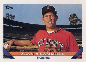
Saturday, February 15, 2014Set: 1993 Topps - Inaugural Marlins (Rate) “ Put him in the HOF! ” -jupiterhill
“ Slaps forehead for mis-spelling Chrome as Chroma on the card that came up today. This card seems somewhat strange, as it appears to me that Topps stamped a player who played for a different team with the new team's logo? Granted, I don't know much about baseball, but I find that strange. Maybe he was taken in the Expansion draft I'm sure they must have held, and that just isn't reflected on his team listing on this card? I don't know, but like I say, it may just be my general lack of knowledge when it comes to anything not NASCAR or basketball. ” -Billy Kingsley
“ great player, not-so-great Topps set... but at least they had the colors pretty accurate for the team... ” -lyfestory
“ Interesting Tigers uni. Must have been a BP jersey, because that never made the field. ” -jlaz10
“ If you are going to make the photograph a portrait, don't make the card a landscape. Leave the landscape for action shots....or team photos. ” -NJDevils
“ Didn't even know this set existed. ” -volbox
“ I... Don't understand... A card in an Inaugural Marlins set that isn't a Marlin.. Why?? ” -Mike67
|
Friday, February 14, 2014Set: 1972-73 O-Pee-Chee (Rate) “ I like this card, everything except the team name, which looks kinda cheesy. ” -Billy Kingsley
“ Hockey... there's always a home for you ugly white guys! ” -SFC Temple
“ The Dom Casual typeface was strictly rationed in Manitoba. However, periods were in ample supply! ” -revnorb
“ I have cards for you ” -Jason
“ I know I have some "vintage" cards from this era (maybe even some hockey)...I'm sure my cards won't be in the great shape this card appears to be! Classic! I don't speak/read French, but I love the O-Pee-Chee line with the International flavor! ” -bkklaos
“ One of my favorite set designs. The 1972-73 O-Pee-Chee, as shown here, also contained players from the upstart World Hockey Association. O-Pee-Chee hockey sets were always bigger than there Topps counterparts, that always bothered me because O-Pee-Chee were much harder for me to obtain as a kid. ” -Gunny
“ This set had some of the best action shots and worst haircuts.I love this set ,definately one of my faves. ” -uncaian
“ Great Card! And I can put my high school French to good use. ” -NJDevils
“ The look on his face is just as silly as this card looks. ” -PDIZZLE
“ Reminds me of 1968 baseball. Nice set. ” -vrooomed
“ That is a rather interesting uniform. I don't know if the photo is off centre or not, but I do know that was a major issue with OPC.. ” -Mike67
“ Why the . after Chris? Is Chris short for something? ” -jackal726
“ When you think Winnipeg Jets, you think of their famous airjet logo, not this one. Nice sweater, though. ” -jlaz10
“ They never use these jerseys when doing throwbacks....I like it! ” -suomibear8
|

