
Random Card of the Day |

Wednesday, February 12, 2014Set: 1981 Donruss Dallas (Rate) “ I bet what they fear is seeing some of the comments from those who hate non-sports cards (for some unknown reason!) ” -Billy Kingsley
“ Damn. You know what? No comment. Just no comment ” -Young Kilo
“ LOL... The original Brokeback Mountain!!! ” -SFC Temple
“ The answer to the question "How bad can a card look when we are producing the set as quickly as possible to capitalize on the popularity of a TV show?".. ” -wamk
“ Okay then ” -jlaz10
“ Who killed J.R.? ” -CluelessJoe
“ this has to be the rarest set in the world because I can't imagine anyone buying these cards ” -NJDevils
“ not touching this one with a 10 foot pole..... ” -Flcardtrader
“ I admit I was but a wee lad when Dallas was on, but I sure don't remember it seeming this cozy... ” -jackal726
“ I'm not recalling these players? Tom Landry with his hat off & a young Jerry Jones? And what were these two doing? Looks like they just got caught spooning! ” -SaveDaKid
|


Monday, February 10, 2014Set: 1960 Nu-Cards Baseball Hi-Lites (Rate) Card: #62 Aaron's Bat Beats Yankees In Series “ Very interesting. The faux newspaper always looks good. I can honestly say I've never heard of this set...or brand, even...before right now. Just another reason to love the Database, learning new stuff! ” -Billy Kingsley
“ Nice RCOTD - I had never heard of this set, probably because of the non-standard size. Looks like a real nice set to own. ” -vrooomed
“ Brings back memories! It was a different type of card back then. A set that looked like newspapers, date and all. It was rough collecting two different sets back then, money was scarce even if the packs were only a nickel and Topps had the "penny packs" too. ” -NJDevils
“ Oh, how much has changed in baseball cards. ” -jlaz10
“ Any day that the Yankees lose is automatically a good day ” -Hollywood42
“ Love the classics! What a great set! ” -flcardtrader
|


Friday, February 7, 2014Set: 2007 Inkworks Hellboy Animated Sword of Storms (Rate) “ Is this this city's rookie card? ” -revnorb
“ Slowly becoming a fan of movie cards... especially ones like this. Love the pic. ” -SFC Temple
“ Not a movie I'd watch, but the skyline shot is kinda cool. ” -Billy Kingsley
“ That is a cool skyline picture! ” -Dixxy
“ Looks like Downtown Detroit after the demons moved in. Didn't realize Hellboy had a set of cards. ” -Mihome316
“ Hellboy = Hellcard ” -NJDevils
“ New York, New York? ” -jlaz10
“ .................................. .......................hahaha....... .................................... ..........Hellboy.........oh dear, what do I know..... ” -SaveDaKid
|
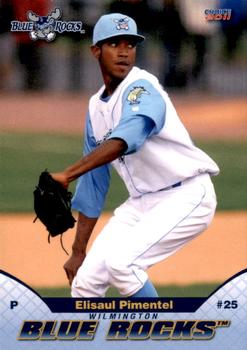
Thursday, February 6, 2014Set: 2011 Choice Wilmington Blue Rocks (Rate) “ I like the big team name, although the silly-looking "TM" symbol makes things look a bit cheesier than necessary. I'm not sure about the two curvy white areas with the "P" and the "#25" in them, what are those supposed to be, Buckminster Fuller's geodesic domes? ” -revnorb
“ Some of these minor league teams have great names. I like this one's moose logo, although not as much as the Richmond Flying Squirrels! ” -Billy Kingsley
“ "Well as owner of this team AND a decorative gravel company, I say we call the team the Blue Rocks!" ” -DaClyde
“ Very well done front. Give this designer a bonus! ” -NJDevils
“ Nice to have a Blue Rocks card as the Card of the Day. Though I must admit, I only know them because they are a Royals affiliate. Sadly, I have also never heard of this guy, so I need to find out more about him. ” -jupiterhill
“ Nice minor league uni, but its interesting how the contrast sleeves are built in to the body. ” -jlaz10
|
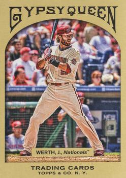
Wednesday, February 5, 2014Set: 2011 Topps Gypsy Queen (Rate) “ I really didn't like the "retro" cards for a long time, but I've done a complete 180 on them. A&G and GQ are two of my favorite lines now. ” -jackal726
“ Gypsy Queen looks best with a coloured border. This looks like the cheap imitation it is, whereas colour masks the vintage (or lack thereof) of these cards. ” -Luckynumber78
“ I never really liked the Nats arched wordmark. Their script one is so much better. ” -jlaz10
“ I know this goes back too far for most of you but to paraphrase Clara Peller: "where's the back, where's the back"? ” -NJDevils
“ Baseball's most over paid player ” -Young Kilo
“ Gypsy Queen...the set where Topps jumped the shark. Every year, I ask myself, why, why, why? ” -flcardtrader
|

Tuesday, February 4, 2014Set: 1992-93 Upper Deck McDonald's (Rate) “ Looks like a giant-sized Patrick Ewing landing on the head of a tiny-sized Scott Skiles. This probably resulted in the brain damage that made Skiles think that the Bucks head coaching job was a good idea. ” -revnorb
“ I just finally completed the base set of these this week, although the majority of the regional issues still elude me. Ewing was great in his prime, but at the end, before the Knicks traded him to Seattle, his idea of defense was to stand there and wave his arms at the ball flying over his head, something that a short time previously he would have jumped up and blocked or stolen. It was pretty comical to see. This card was in his prime, when the Knicks were always a contender. ” -Billy Kingsley
“ Nice front of card. Action shots in basketball are great because you get to see other players in the photo. The back of the card is not great because I have to twist my wrist to turn it sideways, then if you do that, the number is sideways. ” -NJDevils
“ Patrick Ewing was so good that he would actually give birth to other basketball players! ” -bplay24
“ Patrick Ewing is a BIG man and looks twice the size of the two Magic guys in the paint. ” -flcardtrader
“ If I saw this card from his waist down, I would think this is a volleyball card ” -Hollywood42
“ The Knicks never looked good with black in their color scheme. When you think New York Knicks, you think blue and orange. ” -jlaz10
“ at what point do they just give up when selecting pics to use for cards... at this point, I suppose ” -SFC Temple
|

")