
Random Card of the Day |

Saturday, March 13, 2021Set: 2008 Donruss Gridiron Gear - Rookie Gridiron Gems Jerseys Jumbo Swatch (Rate) “ This is pretty cool all around. I really like the design, my only complaint is that the player's photo covers up part of the headline. ” -pugchump
1
“ Although I've never been a football fan, if I were, this is the team I would root for, for hopefully obvious reasons. (although I'm guessing their name comes from the duck or hat parts? I don't know and never looked it up) ” -Billy Kingsley
3
“ No logo on front. Hard to read names. Rookie event photo instead of game action. At least there are stats on the back. Not a fan. ” -SFC Temple
“ Me! Mine! Yeah!
Love to get more of this set! Let's trade! ” -cjjt
“ "Gridiron Gems" I am surprised they didn't make the relic diamond shaped. ” -pjdionne12
“ Great looking jersey patch. ” -parsley24
“ Ah 2008 early days of the fairly new "Jersey Card" or "Game Used" card concept. Still don't like the concept of destroying a perfectly good jersey to cut into 1,000 pieces to glue onto/into cards, but whatevers. These Gridiron Gear Jumbo Swatches are nice looking and I like they are serial numbered, many of the newer "player worn" "relics" are not serial numbered, yet some of the multi-colored border variants of base cards are. Strange. ” -captkirk42
“ Donruss Gridiron Gear was a good brand. I won't mind if Panini brings the brand back. I like this card despite it being a parallel. ” -Brendan Barrick
“ Now that's a good sized swatch! I like it! ” -bkklaos
|

Friday, March 12, 2021Set: 2018 Stadium Club - Chrome (Rate) “ I like the design on this one a lot. Good scan for a chrome card, too. ” -pugchump
4
“ Really good scan of a chrome card. That's hard to do. I'm not a baseball guy but even I've heard of him. ” -Billy Kingsley
2
“ The position is the only thing i dont love about this. Great photo, great back. ” -parsley24
1
“ If there were career year-by-year stats on the back, this would be the perfect baseball card! ” -jayoneill
3
“ This is a very nice looking card. On the back, with the players name headlining in a slight arc over the team name, looks sharp. 👍👍 ” -CollectingAfterDeath
“ Stadium Club. I love that Topps brought it back. Still not a Chrome fan but I do enjoy the regular version. ” -captkirk42
1
“ The photography on Stadium Club is excellent. The card designs don't get in the way. I like that. ” -bpaul14
1
“ I LOVE the photography used in Stadium Club! The name, team, and position on these cards is creative and fun. I always end up with cards that normally wouldn't fit into my collection just because of the artfulness. I could use a little less "chrome." It seems to be moving into every card set like a virus. ” -pjdionne12
2
“ The Man. The Myth. The Cubs Legend. Even though this design makes it nearly impossible to see the team name. ” -OverkillKid
“ I always enjoyed stadium club quite a bit. Loved the cool photos. I think they pictures sort of pop out a little more in chrome and I like that ” -mkb
|
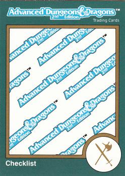
Thursday, March 11, 2021Set: 1993 TSR Advanced Dungeons & Dragons 2nd Edition (Rate) “ I'm nostalgic for the excitement of the Webkinz card. ” -buckstorecards
10
“ I love checklist cards! I even listed one as my most wanted card from 1996-2005, when I finally got it. Upper Deck still produces checklists for hockey, but my other two sports have not seen a checklist in years...Non sports are mostly missing them these days too but I don't have access to modern cards so I can't say with any certainty. ” -Billy Kingsley
1
“ Hahaha, they really couldn't change their design just for the checklists? I think this is really lazy. They could have put some random unused art on the front or just double faced the checklists like sports card usually do. ” -pugchump
4
“ 11 mentions in collections. Mentioned only through secret handshakes and ASCII code in the dark recesses of the internet. ” -parsley24
“ Someone had to put down a whole plate of moms chicken tendies to scan this one in. ” -parsley24
2
“ Lots of weird stuff popping up lately on RCOTD. ” -rmpaq5
“ Considering all the artwork that TSR has to work with, the front is rather disappointing. The back is what I would consider a standard and adequate checklist, which is this cards only saving grace. ” -CollectingAfterDeath
1
“ I love me some non-sports sets and have a love for checklists, as well, but even I would think that space could be filled with something a little more "eye catching" than a repetitive "Advanced Dungeons & Dragons"! ” -bkklaos
1
“ Well that's very plain isn't it? I like checklists normally. I have difficulty with this modern style of checklist with a picture on the front that spans the full card. Of course now days with most checklists being available online (often times pre-production) fewer "checklist cards" are being produced. ” -captkirk42
1
“ This sure is a checklist ” -mkb
“ Talk about classics! Would love to see some D&D trading cards. ” -OverkillKid
“ I was confused until I saw the back. What a lame cover for a checklist. I have a few baseball checklists with players on the front (I'm sure most people also have these) and they're much better than just the logo splattered across the card. ” -NickyCollects
1
“ *in Homer Simpson voice*
NERDS! ” -ketchupman36
|
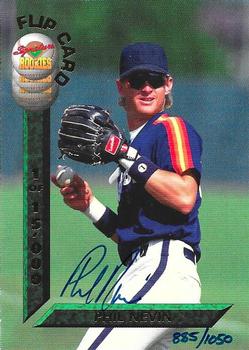
Wednesday, March 10, 2021Set: 1994 Signature Rookies Draft Picks - Flip Cards Signatures (Rate) Card: #NNO Phil Nevin / Paul Wilson “ at first look before scrolling down completely it looked like he was standing by a parking meter. The full image it looks like someone is using a squaring tool to make sure the card was cut precisely. Hey buddy move the "L" square a little more to the left and down some 'Kay? Ugh two players one card, now which is the front and which is the back on this? Slightly annoying. Even if someone wanted both autographs which would you display? Thumbs down. ” -captkirk42
1
“ Oh! I like this very much. No stats, action photos of two different players, signed and sealed. The vertical bar has 1 of 15,000, and the hand written serial number of 1,050. A note of "AU, PR15000, SN1050"? No, of coarse not. Interesting concept none the less. 👍👍 ” -CollectingAfterDeath
3
“ The idea of FlipCards seems good, but without a true back, the card does not seem complete . . . ” -georgecf
1
“ Interesting in that only one side is auto'd. ” -muskie027
|
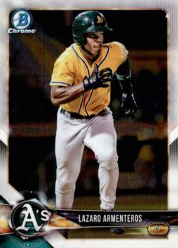
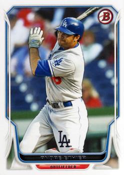
Tuesday, March 9, 2021Set: 2018 Bowman - Chrome Prospects (Rate) Card: #BCP118 Lazaro Armenteros “ Great scan for a Chrome card. Green and yellow are my favorite colors so the uniform looks good to me. ” -Billy Kingsley
3
“ Wow I really like this design. I love it when they add a ton of details without obscuring the photos. ” -pugchump
1
“ In my opinion, 2018 Bowman looked just as good or better than mainline Topps that year. Borders help a lot
Nice looking card, just base chrome ” -mkb
4
“ Cool design for 2018 Bowman, and I have a patch auto of this guy I'm looking to sell *winks* ” -worth_schi
“ OK design. Not a fan of Prospect cards at least this is one connected to a pro team. No idea about this player. Too lazy to look him up just now. Still hate Bowman's numbering system for these sets. Lets see this is a BCP so it is Bowman Chrome Prospect. ” -captkirk42
“ Bowman brings out the anger in me. Hate their numbering especially when they usually have three letters. ” -NJDevils
“ Good action photo on a 99 cent card.
Convinced this was taken during a Beloit Snappers, Low A game in early 2018. He led the minors in strikeouts in 2019. ” -Expos1990
1
“ I wonder how many of the Bowman Prospects actually make it in the end? Seems like whenever I go back and look, I never end up hearing of half these guys. Lazaro is still young enough to be up and coming. ” -muskie027
|
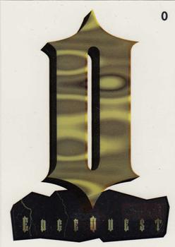
Monday, March 8, 2021Set: 1995 Collector's Edge Excalibur - EdgeQuest (Rate) “ This looks like it might be clear plastic. In that case, cool. ” -Billy Kingsley
“ O ” -YoRicha
8
“ At first glance I thought this was from a "Lord of the Rings" themed set. ” -mkaz80
2
“ I got nothing. ” -rmpaq5
“ O? ” -IfbBirdsCards
1
“ I agree with all the negatives that will be written about this. ” -NJDevils
5
“ I must be slow, as I can't figure this one out. I could make the word "sword" from the letters, but had letters leftover!? Hoping someone explains this subset for me! ” -bkklaos
“ Todays horrible card comment section was brought to you by the letter "O". ” -parsley24
1
“ Uh
It sure is the letter O ” -mkb
1
“ O ” -DarkSide830
1
“ ?Huh? I don't get it. I even looked at the checklist it is for a football set. What? What does it spell?
I was never good at creating anagrams for stuff. OH took using a couple of Anagram maker websites. I guess you need to use the "S" twice to get "Sword & Stone" ” -captkirk42
1
“ O, O! O o o ooo, oo.
0Oo0Oo0Oo...
OOOOOOOOOOOOOOOOO OOOOOOOOOOOOOOOOO! ” -Tanman2001
1
“ Assuming this is a clear acetate card it has at least that much going for it. Beyond that I don't know what this is. Was there a contest to collect the letters to spell different words? ("SWORD" jumped out at me looking at the checklist.) ” -bevans
“ Give me a break . . . ” -georgecf
“ No thank you. ” -Brendan Barrick
1
“ What is this supposed to spell? The checklist doesn't make it clear ” -ketchupman36
1
“ this reminds me of the eye of sauron ” -torald
2
|
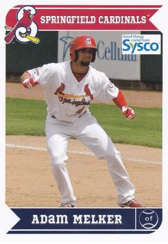
Sunday, March 7, 2021Set: 2013 Grandstand Springfield Cardinals SGA (Rate) “ Learning to play baseball the right way, in the Cardinal farm system ” -abide
4
“ The branding everywhere is kind of lame but it's a nice design for a minor league card either way ” -pugchump
4
“ Cool team logo on the team name bar. The player's position abbreviation inside the baseball icon is smart. Finished off with an excellent choice of the player in game photo, makes this card front pop. The back has a clean look, and the card number inside the baseball diamond is a nice touch. To me, this is an example of a perfect baseball card. ” -CollectingAfterDeath
8
“ Nice sysco block logo must be before the invention of the transparent png file. Really nice back for a minor league card. ” -parsley24
“ Nice Minor League card. ” -captkirk42
“ Great looking minor league card!! ” -mkaz80
“ Love the back. ” -NJDevils
“ Looks like the major card companies could use this as a lesson, sometimes lessen is more. Which Springfield? ” -baseballcardstoreca
“ Why are the last two letters of Adam’s name lowercase? ” -mkb
1
|
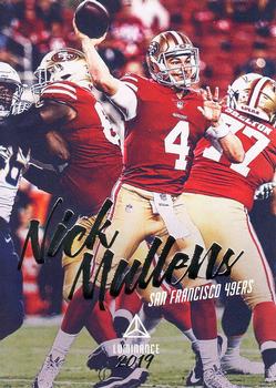
Saturday, March 6, 2021Set: 2019 Panini Luminance (Rate) “ This is a really nice design. I really like it. ” -muskie027
1
“ I don't think Panini understands what the word Luminance means. My autocorrect tried to change Panini to "pain"...well played autocorrect. ” -Billy Kingsley
9
“ It really bothers me that they used the same photo on both sides but they retouched the color on the back only ” -pugchump
3
“ Might as well put his name in comic sans. It would still look better. ” -DarkSide830
“ I like the design of this card. ” -Brendan Barrick
1
“ Wow this card is from 2019? and not the 1990s? ” -captkirk42
|

Thursday, March 4, 2021Set: 2018-19 Panini Select - White Prizms (Rate) “ As a continued brand, this set should be listed as Select. ” -Billy Kingsley
2
“ An OK design. I don't "like" it much but it looks good. Don't know what those side panels are supposed to be other than some fancy border for the card (and possibly the part of the card that would be removed for a die-cut version). Back is rather plain. OH I looked at the card "title" again White PRIZMS those are supposed to be prizms, explains why it is a serial numbered version. ” -captkirk42
“ Talk about a mind wrap of a design. Though this design would be a cool base for a dual relic on the sides. ” -OverkillKid
“ Nothing to write home about. ” -Phil
|

")