
Random Card of the Day |

Tuesday, May 28, 2013Set: 1997 Pacific Prism Invincible - Light Blue (Rate) “ Considering it's purpose is to let light pass through it, there is no less appropriate word to associate with Cecil than "Prism". ” -UNC_Samurai
“ Cool looking design...probably looks even better in person! ” -Billy Kingsley
“ Now I'm slipping into the Twilight Zone..." ” -jlaz10
“ Creepy ” -Hollywood42
“ What a NAME for BASEBALL!!! ” -Dixxy
“ Why, oh, why have two faces of the same guy...Or his that a relic patch of Cecil's actual face? Is this card 1 of 1? ” -SaveDaKid
“ That looks like one of those privacy fences behind him. ” -biggiofn7
|

Monday, May 27, 2013Card: #558 Ryan Whitman / Mark Skeels “ Wooh! Double Babyfaced Shots of teenieboppers!!! ...I don't get Bball... ” -Dixxy
“ Back when they were a major league team ” -volbox
“ I actually like this design. Usually with two player cards they just have headshots, these look like the actual cards. ” -biggiofn7
“ Wow those kids look young. And to think they are both in their 40's now. ” -koloth42
“ Two legendary players- Ryan "Slim" Whitman and Mark "The Animal" Skeels. ” -Dave Sosidka
“ ...Who???... ” -Mike67
“ Wouldn't it have been better of they each got a card, instead of having to share one? ” -Billy Kingsley
“ Are the Marlins the All Time leading team for producing cards of players never to be heard from again? ” -flcardtrader
“ This looks like a showdown at high noon. "This card ain't big enough for the both of us, Skeels." ” -Luckynumber78
“ Oh, the old Marlins teal caps! It's a shame they changed the scheme. ” -jlaz10
|

Sunday, May 26, 2013Set: 2007 Inkworks Hellboy Animated Sword of Storms (Rate) “ I love the movies & comics ,these cards not so much.They look like something I could draw & that's not a compliment folks. ” -uncaian
“ To quote the soup Nazi: "NEXT"!!! ” -NJDevils
“ My fire is unleashed due to my hatred of this card... Well, it's not quite that bad, but this still deserves a "What?" ” -Hollywood42
“ What's going on here? ” -jlaz10
“ Seems like an odd choice for an animated series...not a property that interests me but I'm glad to see another non-sports card chosen for Card of the Day. Maybe one day it'll be one of my own contributions... ” -Billy Kingsley
“ Umm. Yeah. No thanks. ” -koloth42
“ It is kind of hard to see the people through the creepy yellow fog (or fire) ” -Schnidyman
“ You got to be kidding! ” -dobbie
“ Keep it PG... keep it PG... I'm FAILING!!!!! ” -Dixxy
|

Saturday, May 25, 2013Set: 1993-94 Upper Deck (Rate) “ Alert the authorities someone put in a card that's not baseball!!!! I actually like this set, nice front design & back.Good selection of players & inexpensive. ” -uncaian
“ The Red Wings white jersey is another reason why the NHL should switch back to light jerseysat home. ” -jlaz10
“ Interesting expression... ” -Hollywood42
“ He just looks mean and mad at the world. Or else he is scared. ” -biggiofn7
“ I didn't know Quasimoto played hockey ” -Schnidyman
“ That's the look you give as you realise that in 5 seconds you are going to eat puck and there's really nothing you can do about it ” -Dixxy
“ He looks like he just got caught on film doing something he wasn't supposed to! I really like this design UD used that year, the first time I ever saw it was the last time one came up as Card of the Day. Much better than the basketball design that I am well familiar with from that season. ” -Billy Kingsley
|
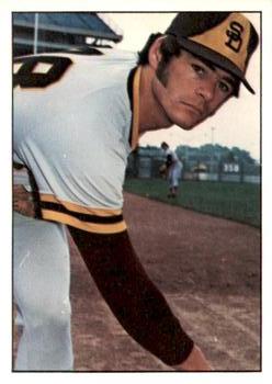

Thursday, May 23, 2013Set: 1989 Best Huntsville Stars (Rate) “ Yup- the scan is cut off. ” -Dave Sosidka
“ Reminds me of the 1982 Topps design ” -Mike67
“ Looks like my high school science teacher. ” -wamk
“ have we finally run out baseball cards that matter??? ” -uncaian
“ The design of the front of this uniform sort of reminds me of a hockey sweater, considering that the entire primary logo is on the chest instead of a wordmark. ” -jlaz10
“ Too old to run that far, man. the camera was only 15 feet away... ” -Dixxy
|


Sunday, May 19, 2013Set: 1971 Dell Today's Team Stamps (Rate) “ Would have been better without the signature...it's distracting. A stamp, eh? I feel "rooked" out of a traditional card today....lol ” -Billy Kingsley
“ The Royals KC logo will never get old. The way the K connects to the C is a classic. ” -jlaz10
“ "Dude! He got on a Dell!" ” -UNC_Samurai
“ A decent pitcher. I remember him mainly with the Pirates. ” -NJDevils
“ Something about this appeals to me ” -Hollywood42
|

")