
Random Card of the Day |

Friday, April 19, 2013Set: 1993-94 Fleer Excel (Rate) “ This isn't a brand I'm familiar with from Fleer, but it looks like the card design is pretty solid- although I have to say it looks more like something from the Topps name than Fleer. ” -Billy Kingsley
“ Usually minor league teams named after their major league affiliates where uniforms based off of their affiliate. However, these unis look nothing like the Angels unis of the time. ” -jlaz10
“ I wonder why Fleer Powerpoint never came out ” -Young Kilo
“ I don't really like the poised cards. ” -Colts12
|

Wednesday, April 17, 2013Set: 1991-92 Upper Deck - Promos (Rate) “ Not a good scan...looks like it was scanned in one of those cheapo no-name brand pages. I don't have this one...at least, I don't think I do. I have lots of promos- a lot of them aren't even on the Database yet...but this one eluded me. ” -Billy Kingsley
“ Great player. Uh not so great owner ” -Young Kilo
“ Superman!! ” -koloth42
“ Nothing need be said ” -SFC Temple
“ Thats a great picture. I think this is a pretty good set. ” -Colts12
“ Some of the best - and worst (looking at you, Skybox) card designs came from early 90s basketball cards. ” -UNC_Samurai
“ Unless MJ isn't fully elevated, he probably missed that dunk by the looks of it. ” -jlaz10
“ Ah. I know him from Space Jam!!! ” -Dixxy
“ Jordan on an Upper Deck card? Who would have thought? ” -wamk
|

Tuesday, April 16, 2013Set: 2010 Topps WWE - Favorite Finishers (Rate) “ My friend finds interest with wwe but I just can't. ” -Colts12
“ Is that the guy from The Walking Dead? I can't believe people pay to see these men fight. ” -Dixxy
“ That doesn't look like a lot of fun to me. At least the photography is centered. ” -Billy Kingsley
“ Rock-a-bye, baby, SMASH! ” -jlaz10
“ It looks like Cena's winning, but it looks like he'll lose a nipple. ” -DanD
“ I pick things up and put them down ” -tonym
“ Cena gives Orton the F U! ” -PDIZZLE
|

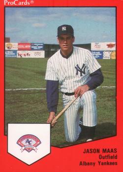
Sunday, April 14, 2013Set: 1989 ProCards Minor League Team Sets (Rate) “ At the time, this would have been my most local baseball team, but it no longer is. Kind of a moot point though as I don't do Baseball. Design is solid...nice big pictures, the relevent information to the card on the bottom right. The only change I would make would have been making the team logo larger, there's a lot of unused white space there. ” -Billy Kingsley
“ Ain't he suppose to be Kevin Mass? ” -Young Kilo
“ Did the Yankees get a BOGO on the Maas family in the late 80's or is this actually Kevin Maas? ” -flcardtrader
“ Old minor league cards were the best. Simple, yet to the point. ” -jlaz10
“ Kevin's brother? ” -suomibear8
“ Combining 2 of my least favorites: ProCards, and the Yankees ” -Hollywood42
|
|

")